Most people jump straight into web design by picking colours and fonts. But that’s a bit like decorating a house before you’ve even laid the foundation.
Without a proper website plan, you end up with messy navigation, web pages that don’t connect, and site visitors who leave confused within seconds. And trust us, that’s not the first impression you want to make when you create a website.
Which is why in this article, we’re going to explain:
- The steps to identify your target audience
- Choosing a layout that fits your goals
- How to spot site structure issues early.
But first, let’s start with website planning basics and why good website structure is important.
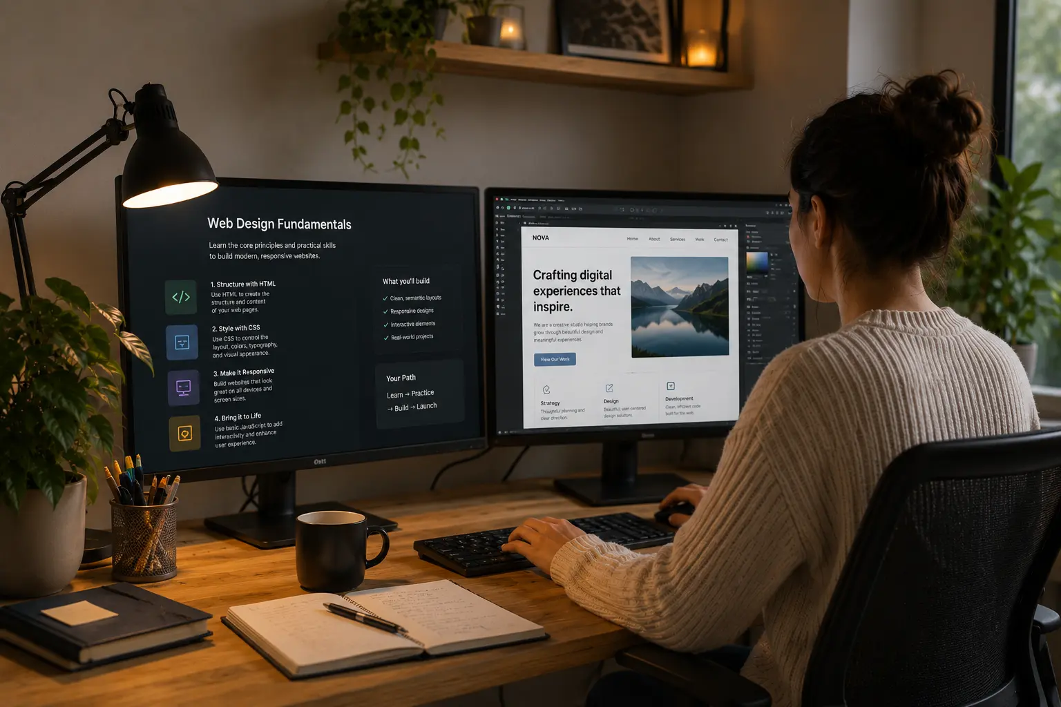
Website Planning Basics: What Beginners Need to Know
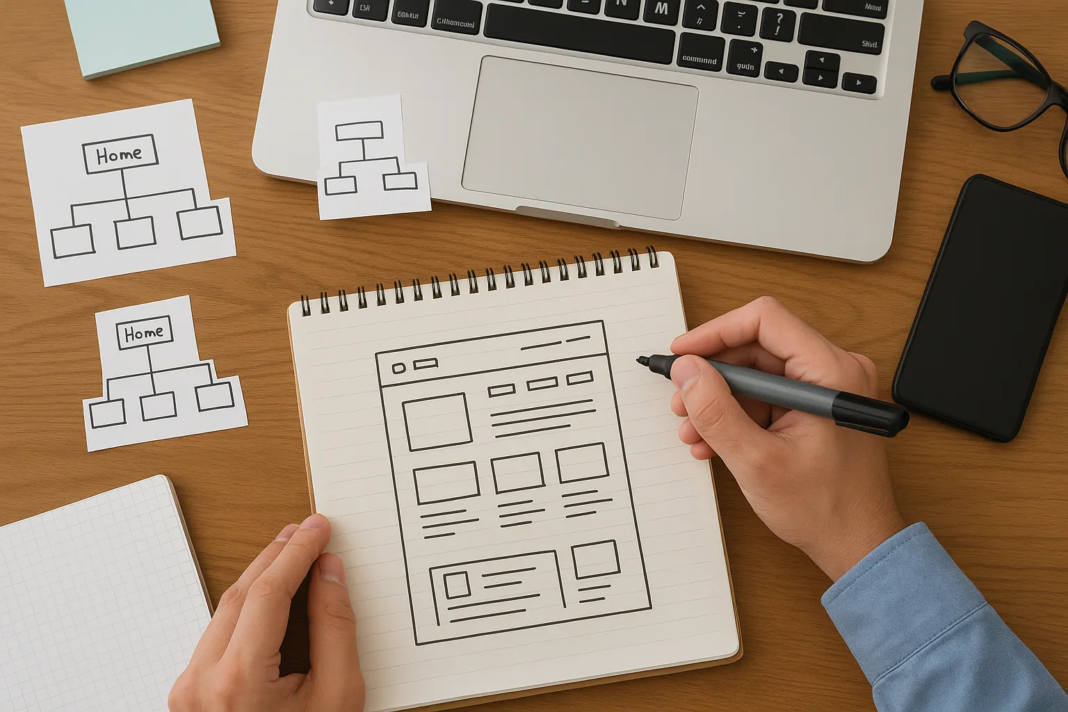
Website planning is the process of organising your different pages, navigation, and content before you touch any design tools or templates.
Think of it like sketching a structure diagram before building anything. You need to know where everything goes first, or the walls won’t line up properly.
The main elements here are simple:
- A clear overview of all the web pages you need
- How users will navigate from one section to another
- Content arranged in a logical, easy-to-follow order
Getting these steps right early can save you from going back to square one with expensive redesigns. Plus, it keeps your site scalable as your business grows.
Pro Tip: sketch your page layout on paper before you open any design tool. It may sound old school, but it’s more efficient.

Reasons Why a Good Website Structure Is Necessary
A solid website structure keeps site visitors on your pages longer, helps search engines find your content, and makes updates far less painful. It also affects how easy it is for users to navigate from one page to the next.
Without a logical structure, however, people will likely lose their track and leave.
Search engines notice this, too, which can tank your rankings over time. Take a look at how a user-friendly site is important.
Enhance User Experience from the First Click
Ever landed on a website and had no idea where to click next? That’s exactly what poor site structure does to your visitors.
People decide within seconds whether to stay or leave. So your website structure needs to guide them right away. For example, clear menus and logical page flow reduce confusion and help users complete actions like purchases or enquiries faster.
We’ve seen how a clunky layout sends people straight to competitors through our work with local business owners (even if your content is actually better than theirs).
Help Search Engines Read Your Site Structure
Search engines like Google use your site structure to crawl, index, and rank your web pages in search results.
This means when you don’t have an effective site structure, search engines struggle to crawl your content. And that happens to tank your visibility in search results.
Pro Tip: Use strong internal and contextual links to boost page authority and help new content get indexed quickly.
Simpler Content Management Down the Track
The best part about a clear website structure is how easy it makes content management for your team.
A planned structure means you always know where new pages belong. Which means no second-guessing or creating duplicate content. And your teams can update and publish blog posts faster when everything has a logical home.
Figure Out Who Your Target Audience Is First
Your target audience influences everything, starting with navigation style to page layout. It’s important to do your research before you start building anything.
Let’s say, a site for tradies in Parramatta needs a different approach than one targeting corporate clients in the CBD (and yeah, we’ve watched that go sideways more than once). Here are four “what” questions to ask yourself:
- What problems does your audience have that your site can solve?
- What device do they mostly browse on, desktop or mobile devices?
- What action do you want them to take once they land on your site?
- What are your website goals, and how do they align with what your audience expects?
When you get clear on these points early, it helps you create a website structure that actually connects with the right people.
Common Site Structure Types Explained
There are four main website structure types: hierarchical, sequential, matrix, and database model. Most small sites stick with a hierarchical structure because it’s simple and easy for users to follow.
The right site structure should depend on your content volume, website goals, and how users navigate your pages. While some structures suit simple business websites with a handful of landing pages, others handle complex content libraries or step-by-step learning paths better.
You can choose your preferred styles from these main types.
- Hierarchical Structure for a Business Website: Hierarchical structure organises web pages in a top-down format. Most business websites and e-commerce websites use this setup. Think of sites like Apple, IKEA, or Kmart Australia. It keeps services, product pages, and contact info neatly organised and easy for users to find.
- Sequential Structure for Step-by-Step Content: Online courses, onboarding flows, and checkout processes often use this sequential structure to keep visitors on a clear path, like a tutorial. As an example, Duolingo and Coursera do this for course modules. The downside is limited flexibility, so it suits linear content rather than sites where users want to explore freely.
- Matrix Structure for Interlinked Pages: It lets users jump between relevant topics based on their interests. News sites like ABC News, The Guardian, and BBC use this because readers want to explore connected stories or user-generated content.
- Database Model for Dynamic Content: The database model works a bit differently from the others. Instead of fixed pages, content gets pulled from a database based on what users search for or filter. This works perfectly for sites with heaps of listings or products, such as Airbnb, Domain, or Seek.
Pro Tip: Try blending structures together instead of being locked into just one approach for your entire site. A dynamic website structure might combine elements from two or three types, depending on what works best for different pages.
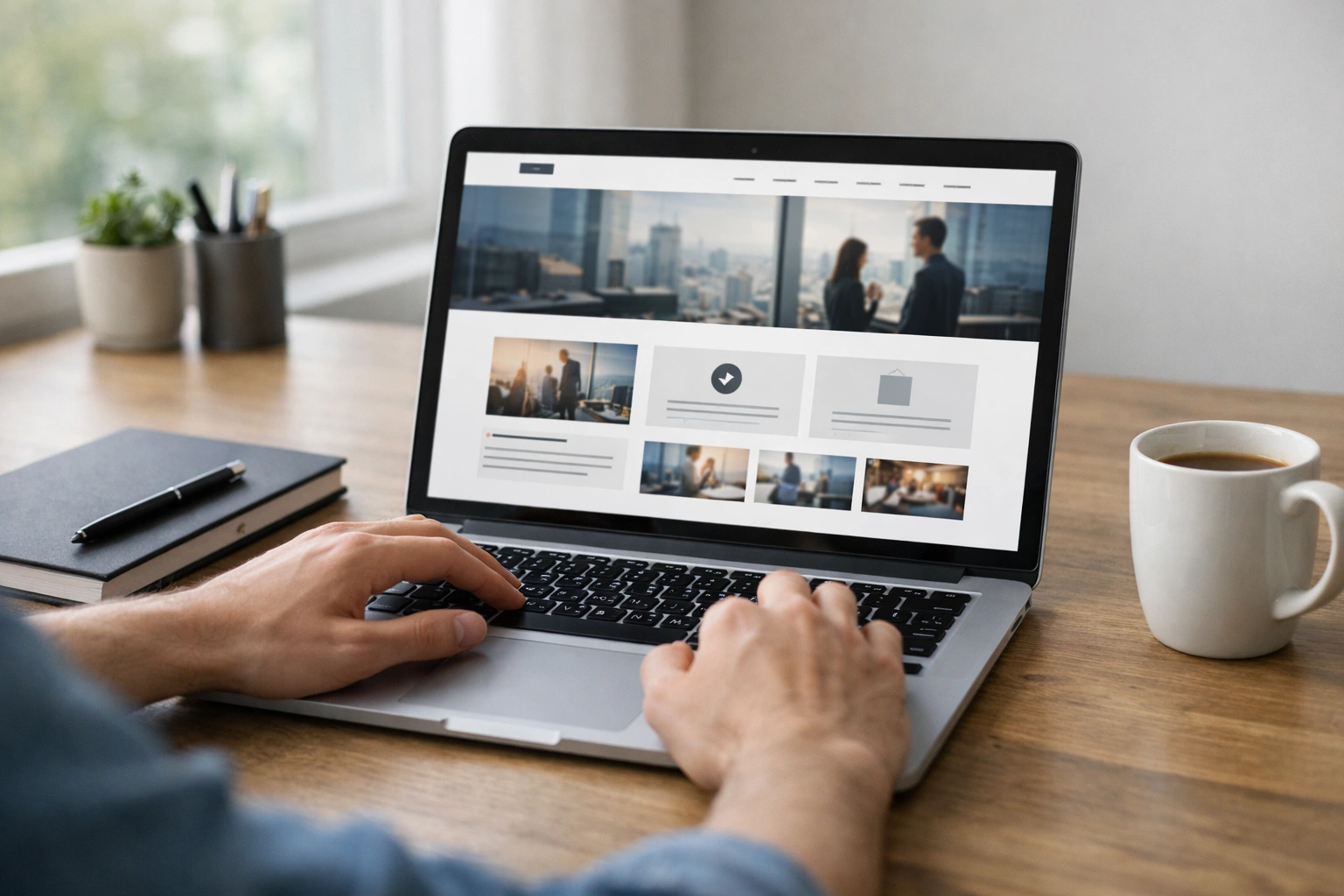
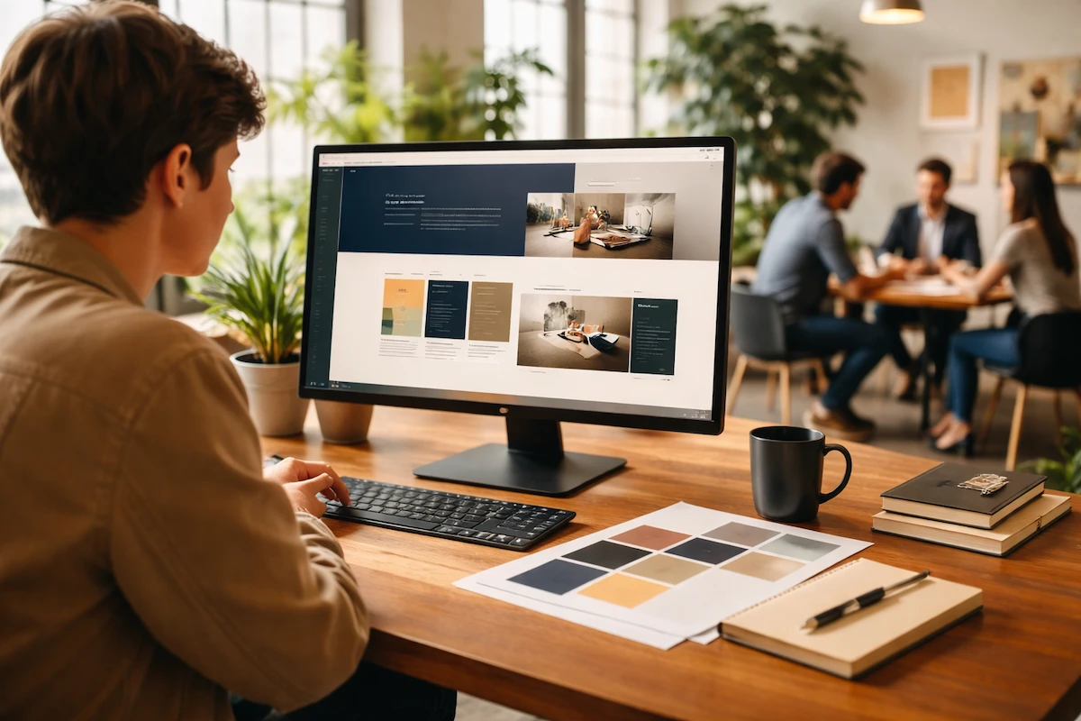
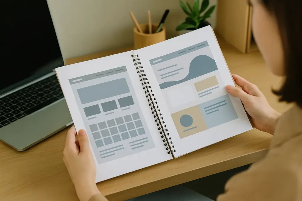
Layout Ideas Worth Trying
Your website layout is how you arrange text, images, and white space on each page to guide the visitor’s eye. Some layout ideas suit image-heavy portfolios, while others work better for text-focused blog posts or product-driven e-commerce sites.
A good website layout includes strong visual hierarchy, balanced layout of page elements, and enough breathing room so visitors can take in what you’re saying without their eyes glazing over.
Here’s a brief overview of the types of layouts.
Grid Layout vs Split Screen Layout
Grid and split-screen layouts may sound similar, but they create completely different user experiences. Choosing between them depends on how you want visitors to move through your page and what message you want to emphasise.
Below is a quick comparison to help you decide which layout works best for your goals:
| Feature | Grid Layout | Split Screen |
| Structure | Rows and columns | Two vertical halves |
| Best For | Portfolios, galleries, products | Two choices or messages |
| Feel | Clean and organised | Bold and high-contrast |
| Focus | Multiple content blocks | Two main focal points |
| Responsiveness | Adapts easily | Needs careful balancing |
Both layouts can work well at times. You just have to choose the one that aligns with your goals and the story your page needs to tell.
When Does an Asymmetrical Layout Make Sense?
When you want your site to feel less boxy and more creative, that’s when an asymmetrical layout makes sense.
Asymmetrical layout breaks away from balanced grids. It uses uneven spacing and varied element sizes to create visual interest. This style suits creative brands, agencies, and portfolios where you want to stand out. It may not appeal to everyone, but it works for the right audience.
The downside is that, without a clear visual hierarchy, asymmetrical designs can feel chaotic and make content harder to follow (we’ve untangled a few of those ourselves). A visually appealing result takes thorough planning.
Pro Tip: Don’t forget about interactive elements like buttons and forms. These should sit where users naturally expect them, often starting from the top left corner.

Identifying Site Structure Issues Before They Snowball
Now that you know the basics of website structure and layout, let’s talk about spotting problems before they cause painful headaches.
To give you an idea, broken links, orphan pages (lonely little pages with zero internal links pointing to them), and confusing navigation are signs your site structure needs attention. And honestly, that’s just the start.
Take a look at some common red flags to watch for:
- You might have broken links that lead to dead ends or error pages.
- Some pages may be missing entirely from your menu or sitemap.
- Certain blog posts end up buried so deep that visitors never discover them.
- In some cases, the site lacks strong contextual links connecting related content.
- Sometimes the URL structure confuses both users and search engines.
This is why running regular audits helps you catch these problems early. Tools like Google Search Console can flag crawl issues and broken links for you. User testing is another good way to see where people get stuck.
You can schedule a structure check every few months as your site grows. A great website structure needs ongoing care, not just a one-time setup.
Time to Map Out Your First Site
Good website planning starts with understanding your target audience, choosing a site structure that fits your goals, and picking a website layout that keeps things clean and easy to browse. That’s how you get a smooth user experience that keeps visitors around longer.
And keep in mind that you can always expand your website structure later once the bones are solid. So don’t stay stuck; instead, focus on getting a great website structure in place first, and the rest will follow.
If you need a hand putting it all together, our team at Class Room Encounters can help you plan and build a site that both your business and your visitors will love.