
Small organisations usually build websites on tight budgets without the luxury of professional designers. You’re working with limited time, often without a dedicated web team, and a long list of other priorities competing for attention.
Under that pressure, websites are built quickly just to get something live. They obviously exist, but they don’t actually guide users where they need to go or make it easy to take action.
The good news is that most website mistakes don’t need expensive fixes or complete redesigns. This article covers the most common problems small organisations face and practical ways to fix them without starting from scratch. Let’s get straight to the point.
What Makes a Website Look Unprofessional?

A website looks unprofessional when visitors see outdated design, inconsistent branding, or clunky layouts that feel stuck in 2010. And they notice these problems almost instantly. First impressions form in 50 milliseconds, which means users judge your site before they’ve even read a single word.
Visual inconsistency is one of the biggest reasons this happens. For example, when your website uses different fonts on every page or colours that don’t match your branding anywhere else, visitors start questioning whether you’re legitimate. They see the mismatch and wonder if you just threw something together over a weekend.
Amateur website design choices make this worse. Cheap-looking graphics and cluttered layouts full of competing design elements work against you. When someone’s deciding whether to donate or book your services, these details undermine the trust you’re trying to build.
Ignoring Mobile Users Costs Your Visitors
If your site doesn’t work on smartphones, you’re ignoring 64% of all web searches. That’s more than half your potential audience gone before they even see what you offer.
More importantly, Google uses mobile-first indexing, which means it judges your entire website based on how the mobile version performs. Without a proper responsive design that works on different screen sizes, you’ll rank lower in search results.
We’ve worked with organisations in Melbourne who lost half their donation traffic simply because the donate button was impossible to tap on a phone screen. When users struggle with tiny text or broken layouts on mobile devices, they leave (and nobody’s going back to pinching and zooming like it’s 2005).
Slow Load Times: Why Speed Actually Impacts Your Bottom Line
It just takes one second longer to load your website. How much damage could that possibly cause? Apparently, a lot. Google research shows that bounce rates increase by 32% when page load speed goes from one second to three seconds. In other words, many visitors leave before they ever see your message.
That slowdown doesn’t happen by accident. When a website feels slow, the cause usually comes down to two things: technical issues and design choices.
Technical Issues That Slow Your Site
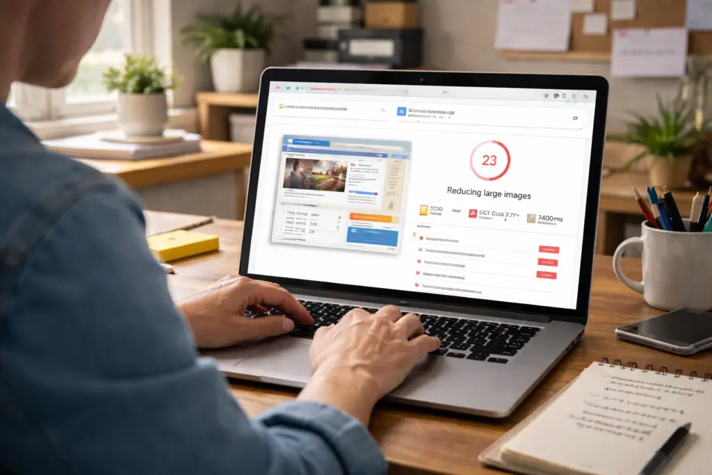
Oversized images are one of the biggest culprits. When you upload photos straight from your camera without compressing them, each image can be several megabytes. If you compress files before uploading, you can cut load times without losing visible quality.
Too many plugins create similar problems because each one makes another request to the server. Your hosting plan plays a role, too. Budget hosting usually struggles during traffic spikes, which means slower performance when you need speed the most.
Design Choices That Hurt Performance
Cluttered layouts slow everything down by cramming too many design elements onto one page. This overwhelms users and hurts loading speed at the same time. Removing unnecessary sidebar widgets and redundant images can shave a couple of seconds off load times without losing anything visitors actually need.
White space helps reduce that complexity. Without it, dense layouts with text and images packed together feel chaotic on mobile devices. Giving users room to focus often means fewer elements to load, which improves both performance and perceived speed.
Confusing Menus and Hidden Pages Drive People Away
Have you ever clicked through three different pages on a site and still couldn’t find the pricing or contact info? Your visitors feel that same frustration. When your homepage doesn’t clearly explain what you offer or when menus hide basic web pages, people leave without exploring further. They’re not going to hunt around trying to decode your site structure.
Complex navigation compounds that frustrate. Overly creative labels might sound clever in meetings, but they confuse users who just want straightforward categories (we’re looking at you, “Portal” instead of “Login”). If someone needs to guess what “Hub” or “Resources” actually means, that’s a problem.
This is why navigation depth is so important. When you bury important pages three or four clicks deep, users get frustrated and give up. Most will simply choose a competitor with clearer menus and internal links that guide them where they need to go.
Missing Calls to Action and Buried Contact Details
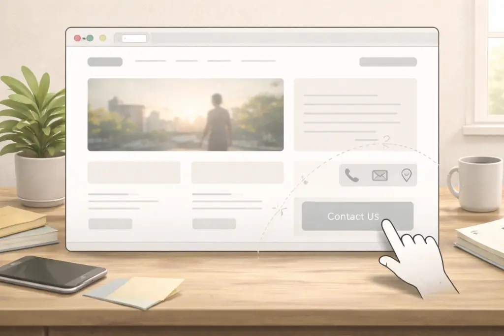
Even if you’ve fixed your navigation, you’re not out of the woods until people can actually reach you. Here’s where most small organisations trip up:
- Hidden Contact Details: When your phone number or email is buried in the footer or behind multiple pages, visitors give up before they reach out. This creates unnecessary barriers, especially when someone’s ready to book your services or learn about your donation process.
- Vague Calls to Action: A button that says “Learn More” could lead anywhere: another page, a PDF, a contact form. Nobody wants to click just to find out. And yet we see this everywhere. Clear calls to action in plain language tell users exactly what happens next.
Making your contact information easy to find and your calls to action specific takes minutes but can improve how many people reach out.
What You Can Do Starting Today
Start with quick wins like compressing images and making your contact details easy to find. These small improvements don’t require technical expertise or a big budget, but they can significantly improve usability and keep visitors engaged.
Next, try simple user testing. Ask a few people to navigate your site and provide honest feedback on what confused them. This often uncovers usability issues you might never notice on your own.
For more practical tips on web design and improving user experience, visit Class Room Encounters. Our articles and guides show you how to make your website more user-friendly, one small change at a time.