Visual communication still beats algorithms in 2026 because human designers understand what automation misses: context, emotion, and the psychology that drives customer decisions.
AI design tools promise fast, affordable visuals. But they can’t understand your customers, your market position, or what makes people choose you over competitors. Through our work with Melbourne and Sydney businesses, we’ve seen the difference strategic visual communication makes.
In this article, we’ll cover:
- Visual communication drives better results than templates
- Human designers bring what automation can’t replicate
- Brand identity that customers remember
- 2026 design trends worth your attention
Let’s explore why investing in real graphic design still pays off.
What Is Visual Communication and How Is It Connected to Good Design?
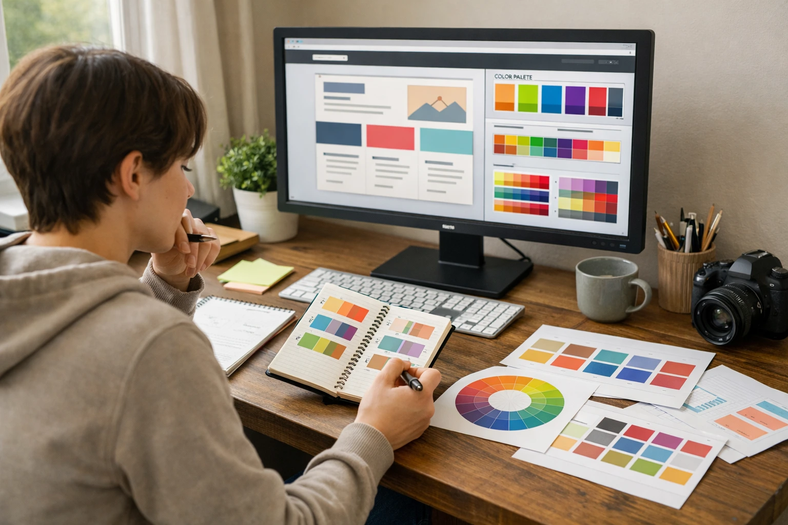
Visual communication uses images, colours, typography, and layout to convey messages without relying on words. It’s the foundation of good design. Why? Because it determines whether customers understand, trust, and remember your brand instantly.
Here’s how this works in practice. Your logo, colours, and typography communicate brand personality, while images trigger emotional responses that text alone can’t achieve. What’s more, layout guides attention to your key messages.
When these elements align properly, they create instant recognition and build the trust needed to convert visitors into customers. (If you’ve ever left a confusing website within seconds, you’ve experienced poor visual communication firsthand.)
This instant recognition happens because of how fast our brains process visual information. MIT research shows the brain recognises images in as little as 13 milliseconds. That’s why cohesive visual communication works so effectively.
When we work with Melbourne cafes and Sydney startups, the businesses that align their visual elements consistently get noticed immediately. On the flipside, competitors with mismatched branding fade into the background. This recognition advantage directly impacts which brands customers trust and choose.
Three Ways Visual Communication Impacts Your Bottom Line

Visual communication boosts your revenue through faster recognition, better retention, and stronger trust. When your branding looks professional and consistent, customers respond differently. They notice you, they remember you, and they’re more willing to buy.
Here’s how it works.
Brand Recognition Happens Faster
Visual information reaches the brain faster than text, making visuals your first impression. When you use a consistent brand identity across your website, social media, and shopfront means customers spot you instantly. This speed cuts your marketing costs significantly.
People Remember What They See
People retain 65% of information when it combines visuals and text. What about text alone? Well, only 10%. The reason is simple. Images create emotional connections that stick in memory longer than words. This improved recall brings customers back when they’re ready to buy.
Trust Builds Through Consistency
Consistent visuals across your website, social media, and marketing materials signal professionalism. Here’s what we’ve seen. From our work with Australian businesses, cohesive branding reduces customer hesitation and speeds up recognition.
Also, when your visuals match everywhere, people trust you faster. That familiarity drives purchases.
What Separates Human Creativity from Automated Design?
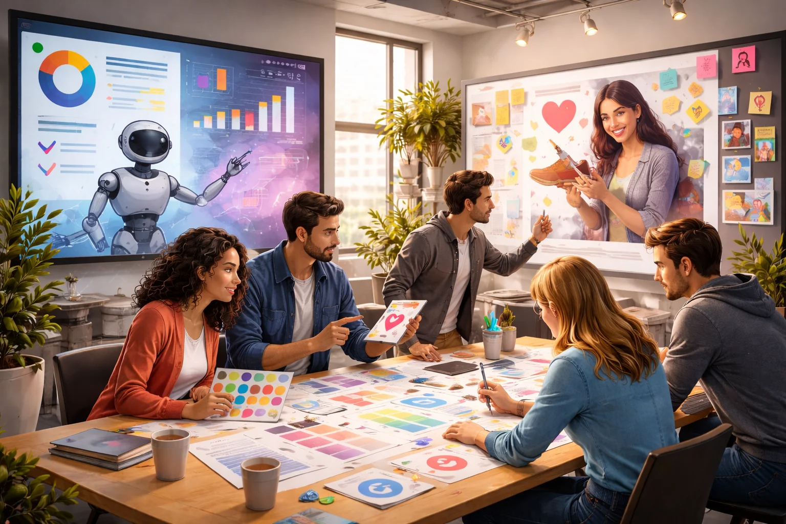
Human creativity brings cultural awareness, emotional intelligence, and business thinking that automated tools can’t replicate. You might be thinking AI’s getting pretty good, and you’re right.
But AI tools cut corners on understanding your audience. Real designers start by understanding your market, competitors, and customer psychology. That research shows up in three specific ways.
Understanding Context and Culture
Graphic designers consider cultural context before making any design decisions. This awareness changes everything. Colour meanings and symbols need human judgment that algorithms miss.
For example, blue signals trust in Sydney but means something different elsewhere. Designers adapt based on where you’ll use visuals.
Emotional Intelligence in Colour Choices
Human designers understand colour psychology and how palettes trigger emotional responses in your audience. Templates can’t do this because they ignore who you’re reaching. In contrast, thoughtful colour selection considers your brand identity, customer psychology, and cultural associations that algorithms miss. Whatever AI misses, designers catch.
Strategic Thinking Beyond Templates
Real designers solve business problems through visual communication by considering user experience, conversion goals, and how visuals guide behaviour toward specific actions. Keep in mind that templates offer generic solutions. On the flipside, human creativity adapts to your unique challenges and audience.
Visual Elements That Build Brand Identity

The best part about building a strong brand identity is instant customer recognition. Through our projects with Melbourne startups and Sydney retailers, we’ve watched businesses double their repeat customer rates with cohesive visuals. Every touchpoint working together creates this recognition.
Let’s look at the components:
- Logo design: Logos are meant to capture a brand’s personality. When customers see it across platforms, they recognise your business instantly without reading any text.
- Typography choices: Fonts speak volumes before anyone reads a word. For example, professional serif signals tradition, while modern sans-serif communicates innovation and accessibility to your audience.
- Colour schemes: Strategic palettes evoke specific emotions and maintain consistency across materials. For instance, Blue builds trust in finance, Green signals wellness, and Warm tones make food brands inviting.
- Photography style: Authentic images reflect brand values properly. More importantly, curated imagery creates emotional connections and showcases the real people or products behind your business.
- Graphic elements: Supporting components like patterns, icons, and shapes reinforce brand recognition. These design details hit the nail on the head when customers see them repeatedly.
These elements form your visual foundation, but professional designers know how to combine them for results.
Core Components Every Graphic Designer Uses
Every graphic designer relies on three core components to create effective visual communication. Typography, colour palettes, and imagery. Each one plays a specific role in building designs that connect and strengthen your branding.
Watch what happens when you apply them correctly.
Typography That Speaks Your Brand Voice
Font selection communicates personality instantly. Typography guides readers through content and highlights important information throughout your designs (and yes, Comic Sans for a law firm is still a hard no). Pairing complementary typefaces creates interest while maintaining consistency.
Colour Palette With Purpose
Thoughtful colour choices trigger psychological responses that influence customers’ outlook. The impact is immediate. Consistent application across platforms strengthens recognition. Plus, accessible contrast means everyone can read your content, whether they have perfect vision or not.
Imagery That Connects Emotionally
People respond faster to visuals, which is why high-quality images create emotional connections that words can’t replicate. Consistent photography style reinforces your brand identity. From our work with clients, we’ve seen how planned image selection guides viewers toward conversions.
How Does Visual Communication Drive Sales?

Visual communication drives sales by building trust, guiding customers through your funnel, and creating emotional connections that lead to purchases.
But here’s where it gets interesting. Strong visuals directly boost engagement, conversions, and customer loyalty. Professional graphic design establishes credibility that makes customers willing to invest in your brand.
Also, visual hierarchy guides people through your sales funnel and highlights calls-to-action effectively. Remember, poor hierarchy hurts. We’ve seen conversion rates drop by 40% from messy layouts alone. When your branding stays consistent, it reduces decision fatigue. This builds emotional connections that increase customer lifetime value.
Clear visual communication eliminates confusion and drives action. Which design trends support this best in 2026?
Design Trends Worth Following in 2026
Design impacts your bottom line. The question is, which trends in 2026 truly deliver? Let’s be real. Not every trend deserves your attention. Some genuinely improve customer experience, while others just waste time and money. Following trends blindly won’t bring your brand up to scratch.
Here are five that deliver results.
- Bold, modern typography: Large expressive fonts grab attention and communicate brand voice instantly. They separate memorable brands from forgettable ones in crowded digital markets.
- Minimalist design thinking: Clean layouts improve site speed and help customers focus without distractions.
- Authentic photography: Real photos showcase genuine brand personality better than stock images. What’s more, audiences connect emotionally with authentic imagery better than generic libraries.
- Interactive graphics: Subtle animations make visuals feel responsive without overwhelming visitors. These micro-interactions keep people exploring longer than static designs.
- Accessible design standards: High contrast and readable fonts reach broader audiences, including those with visual impairments. Following accessibility guidelines can expand your potential customer base by 15% or more.
These trends deliver results when applied thoughtfully to your specific business. The key is working with designers who understand your goals.
Real Design for Real Results
Algorithms generate designs fast but miss the emotional intelligence that gets people to buy. Reality check is that businesses face challenges that need custom solutions. Unfortunately, templates can’t deliver them. Professional graphic design solves this by building trust, driving recognition, and creating connections that convert.
In this guide, we’ve covered three important areas. Why human creativity beats automation, how visual elements build lasting brand identity, and which design trends deliver measurable results for Australian businesses?
Professional designers elevate your branding with proven expertise. Our team at Classroom Encounters will guide you through every component and strategy needed to create visual communication. With our help, you will successfully convert customers and strengthen your brand. Let’s build something memorable together.