
Ever landed on a website and immediately felt like something was off? That reaction often starts with a colour mismatch.
The colours you choose for your website influence how visitors see your brand in less than a second. So, if you’ve ever stared at a blank screen wondering which web design colors actually work together, you’re not alone. Most beginner designers struggle with this exact thing.
But here’s the good news. But here’s the good news. You don’t need years of design school to nail your colour scheme. We’ve built hundreds of websites, and most colour mistakes come down to a few basics that nobody explains properly.
So, let’s break it down in a way that actually makes sense.
What is Color Theory in Web Design?
Color theory in web design is the practice of choosing and combining colors based on how they relate to each other. It ensures your website looks cohesive, professional, and creates the right emotional response from visitors.
To understand more about color theory, you need to start with two fundamental concepts:
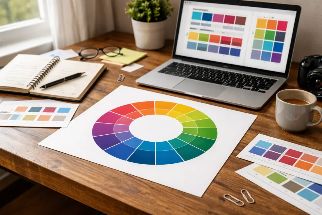
The Color Wheel Explained
The color wheel shows relationships between primary, secondary, and tertiary colors in a circular format. With it, designers easily understand which colors clash and which ones gel naturally together.
Most online color palette tools you see are built around color wheel principles. Once you understand how this wheel works, you can pick colors without feeling confused. That’s because the wheel visually shows how hues relate to each other, which shades create harmony, and which create contrast.
Primary Colors and How They Work
Basically, red, blue, and yellow are the foundation colors. All other colors come from mixing these three primary colors. But you can’t create primary colors by combining other hues since they are the starting point for any palette.
Understanding primary colors also lets you build various color schemes. For example, when you mix blue and yellow, you get green. This way, you can mix different amounts of blue and yellow to create different shades of green.
How Do You Pick Color Schemes for Your Website?
You can pick color schemes by starting with your brand identity, using the color wheel to find harmonious combinations. Then test them with contrast checkers to ensure they’re accessible and readable for all visitors.
Here’s how to approach this process step by step.
Start with Your Brand Perception
Your color combination directly influences how visitors feel about your business within the first few seconds. That’s why different industries tend to rely on specific colours. For instance, blue builds trust in finance, while green works well for health and wellness brands.
Drawing from our experience with Australian business clients, we’ve noticed that choosing the right colors often starts with what your brand reflects. For instance, a law firm inspired by traditional values might lean towards navy and grey. Meanwhile, a creative agency could go bold with orange or purple.
Pro tip: Test your color palette on real users or colleagues before investigating whether it matches your intended vibe.
Use a Contrast Checker for Accessibility
Contrast checkers test if your text is readable against background colors for people with visual impairments. During contrast testing, you can follow the WCAG guidelines. With this guideline, you can explore different contrasts, like minimum contrast ratios of 4.5:1 for normal text and 3:1 for large text.
You might be wondering why these specific ratios are needed. Well, they’re based on years of accessibility research to help you set the right contrast.
High contrast between dark backgrounds and light text (or white text on dark backgrounds) ensures everyone can read your content easily. On the flip side, poor contrast frustrates users and can hurt your SEO rankings with a high bounce rate.

Popular Color Combinations That Truly Work
The best thing about tried-and-tested color combinations is that you don’t have to reinvent the wheel. These proven color schemes already give you a solid starting point that works for any website.
Now, let’s have a look at a few popular color combinations that deliver different moods and results.
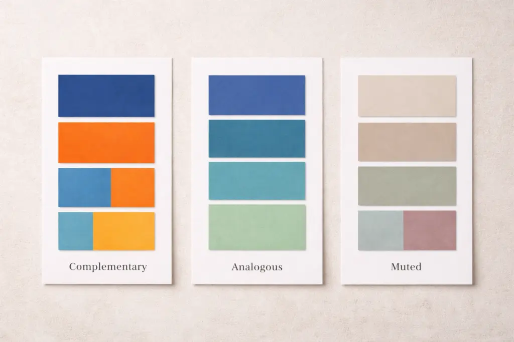
Complementary Colors for Bold Designs
Complementary colours sit across from each other on the colour wheel, like blue and orange or red and green. They create high visual impact and energy that is perfect for call-to-action buttons or attention-grabbing headers.
But wait, there’s more to it. You must maintain balance when mixing these colors. For instance, let one colour do most of the work and use its complement in small accents. Because overusing both can make your design feel cluttered.
Quick tip: When you want to draw attention to important elements or create contrast that pops, complementary colors with vibrant tones work brilliantly here.
Analogous Palettes for Smooth Harmony
Analogous color schemes use 3-4 similar colors that sit next to each other on the color wheel, such as blue, teal, and green. These palettes feel naturally cohesive and calming.
They work great for wellness, education, or creative industry websites where you want visitors to focus on content rather than flashy design elements. That’s how cool tones in analogous arrangements create an aesthetically pleasing flow that feels effortless.
Muted Tones for Professional Websites
Muted tones are desaturated versions of bright colors. They project sophistication and maturity, commonly used in corporate, legal, or luxury brand websites (and yes, grey-on-grey websites are still haunting the internet).
We’ve seen that pairing muted tones with one accent color creates balance without looking boring or flat. That single bright accent pairing color can give your website enough personality while maintaining a professional aesthetic.
Tools Graphic Designers Use to Create a Color Palette
Free online tools eliminate the guesswork from color selection, allowing you to generate professional palettes in minutes instead of hours of trial and error.
Here are three tools that graphic designers and beginners mostly rely on:
- Adobe Color: This tool (formerly Kuler) generates website color schemes automatically based on harmony rules. Here, you can also explore trending palettes for inspiration or upload an image to extract colors from photos you love. For example, if you find a sunset photo with perfect tones, Adobe Color pulls those exact shades into a usable palette.
- Coolors: With it, you can press the spacebar to see new colour palettes appear instantly. You can also lock colors you like and randomize others until you find the right combination. This tool provides a speed that makes it easy to experiment with your website color scheme.
- Contrast Checkers: These types of tools (like WebAIM) ensure your chosen colors meet accessibility standards before you launch. Plus, they test whether your text is readable against backgrounds to inform you exactly where adjustments are needed.
Bottom line: Start with Adobe Color or Coolors to build your palette, then run it through a contrast checker before going live. This three-step process works every time.
Common Color Mistakes (And How to Avoid Them)
Studies show that 85% of shoppers say color is the main reason they choose one product over another. Yet most beginner designers make the same avoidable mistakes that kill conversions.
Here are the most common color mistakes we see and how to fix them before they hurt your website.
Common Mistake | Quick Fix |
Using 5+ colors throughout the site | Stick to 2-3 primary colors plus one accent color |
Poor contrast between text and background | Test with contrast checkers, aim for a 4.5:1 ratio minimum |
Ignoring color psychology for your industry | Research what competitors use, then decide to match or stand out |
No visual hierarchy with colors | Use bold or vibrant tones for important elements only |
Verdict: Your color scheme should create a visual hierarchy on your site. That’s why use your primary color for backgrounds and larger sections, then apply accent colors for buttons or important features. You can also consider the earthy tones and muted palette that let your content shine, while using accents for cheerful, playful brands.
Start Mixing Your Perfect Color Palette
You’ve got the basics of color theory now. From the color wheel, primary colors, to proven color combinations, you have everything that builds a proper website color palette.
Don’t overthink it. Start with 2-3 colors that reflect your brand, test them with a contrast checker, and adjust as needed. In this case, you can also take inspiration from other websites in your industry, but make your color scheme on your own. Because the colors you pick today will shape how the world sees your brand tomorrow.
Ready to put these principles into practice? Class Room Encounters offers hands-on web design courses that teach you how to build beautiful, functional websites from scratch.
Contact us today, and let’s convert your color palette ideas into a real website.