Did you know your website has about five seconds to make an impression? You’ve heard it right.
Visitors judge your website within those seconds and decide if they want to stay or leave. Generally, this judgment happens based on the visual impact of your site. It tells people whether your business is legit before they read a single thing. So, if you don’t understand what drives this snap judgment process, you’re probably losing visitors.
But don’t worry. In this article, we’ll share those elements that drive your visitors’ positive judgment, including:
- Design elements that create first impressions
- How user behavior works in those opening moments
- How to collect data that shows you what’s really happening on your site
Let’s get started.
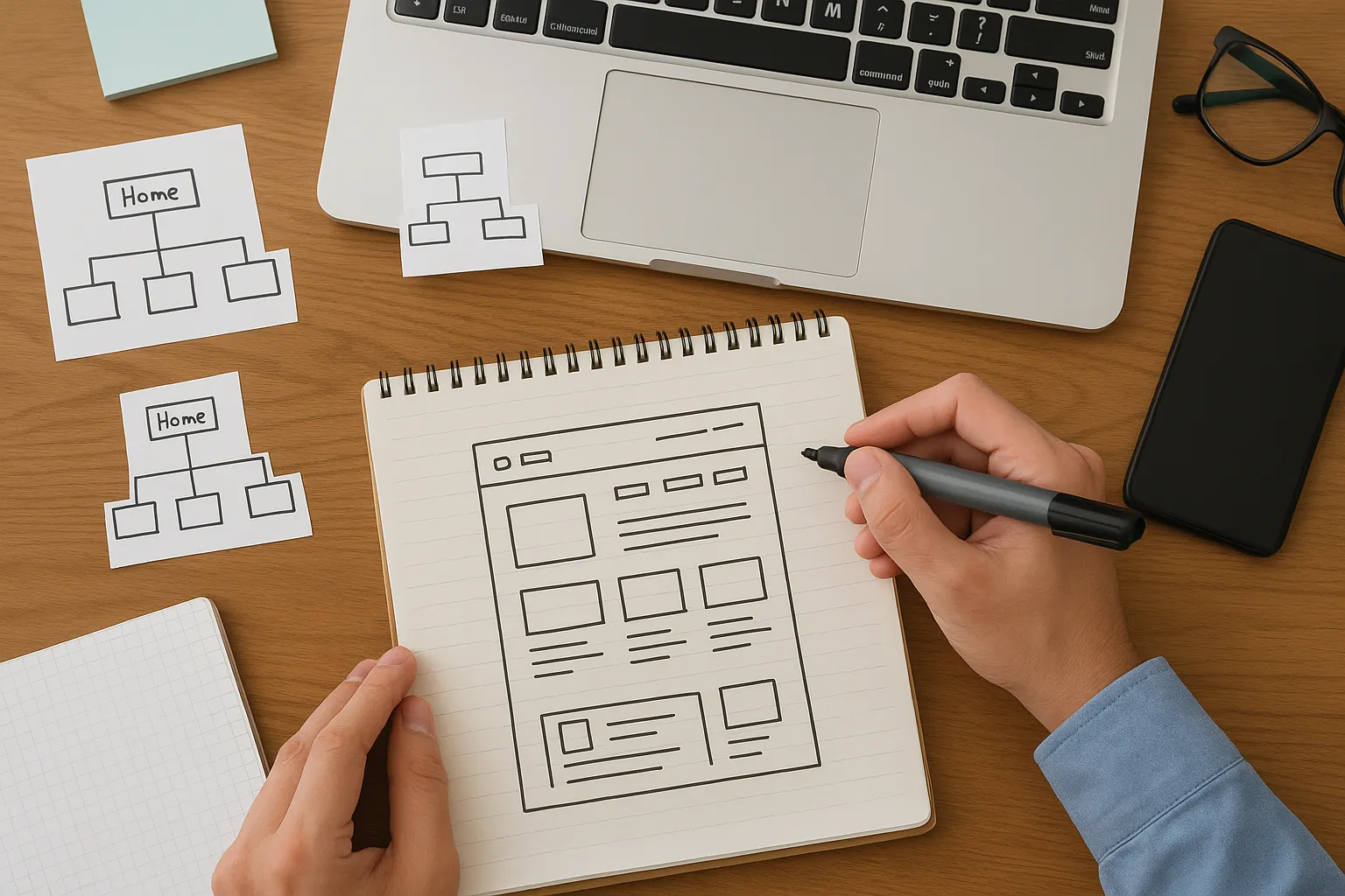
First Impression Design: How the First Three Seconds Affect Your Website
As we’ve already mentioned, the first three seconds affect your website by determining whether visitors stay or leave based on its colors, layout, images, and spacing trigger. Plus, user behavior in those opening moments decides your bounce rate, engagement, and conversions.
Now, let’s break down what actually influences user behavior before they even interact with your pages.
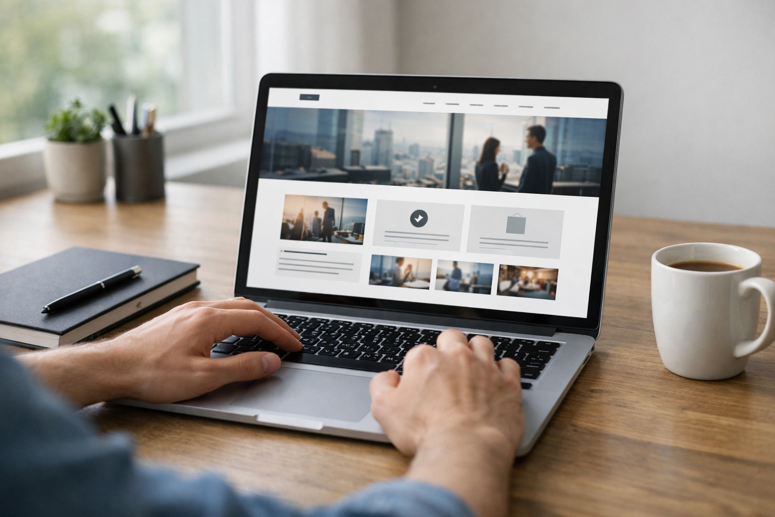
Visual Impact Makes User Behavior Before They Read a Word
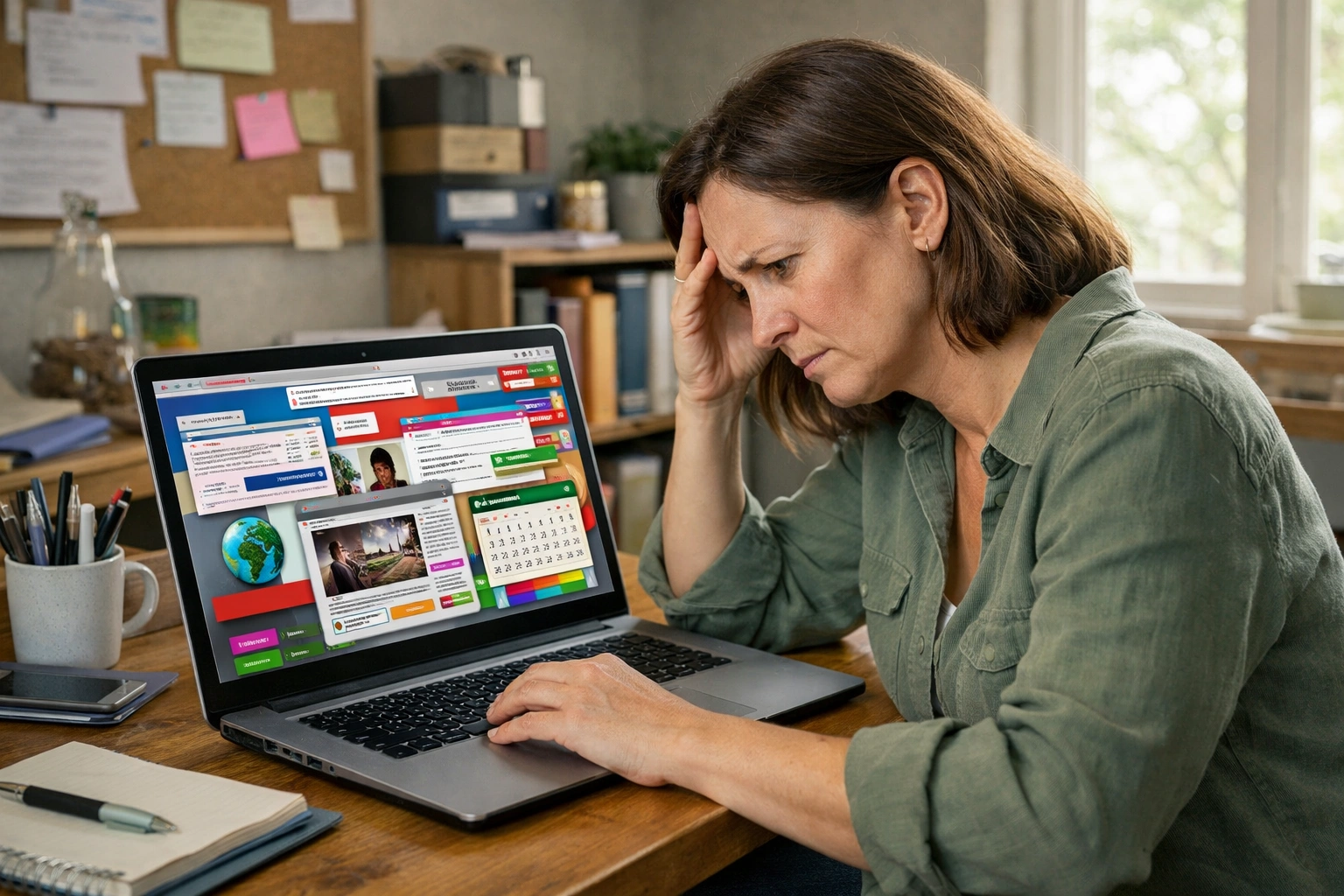
When users land on your site, they’re not thinking “hmm, let me analyze these design elements.” They’re feeling something about your design: bright colours might energize them when cluttered layouts might stress them out, and professional photography might build trust.
Busy or outdated designs also make visitors question whether your business is still operating. One client came to us after losing half their traffic, and the main issue was their outdated homepage. It looked like it hadn’t been touched since the time MySpace was cool (can you believe it?).
At such moments, wise visual choices guide people toward taking action without confusing them. For example, a well-placed call-to-action button naturally draws the eye. So, users don’t consciously think “I should click this.” They just do it.
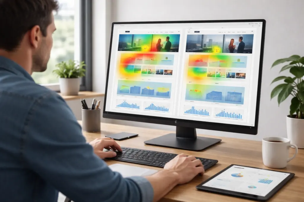
How UX Designers Measure First Impressions
Basically, UX designers collect first impressions data by using heat maps, scroll tracking, session recordings, and A/B testing.
These technologies help you understand how users react in the first few seconds after landing on your site:
- Heat Maps and Scroll Tracking reveal exactly where visitors look in those opening seconds.
- Session Recordings show real user behavior, including hesitation, confusion, or immediate engagement (that’s the gold standard for understanding what’s not working).
- Applying A/B Testing on different visual approaches helps identify which designs keep people on your site.
Together, these insights remove guesswork and make it easier to decide which visual changes truly improve engagement.
The Science Behind Website Credibility
According to studies, 75% of website credibility comes straight from design. Especially, designs that are based on visual factors like typography, colour schemes, and layout rather than your actual content or credentials.
Let’s be honest here. You may have the best products and years of experience, but if your website looks amateur, people bounce away immediately. That means, your visual presentation brings the impression that doesn’t come from your About page or testimonials.
Poor colour choices or layouts also damage trust faster than any negative review could (even if your business has been around for decades). We’ve seen established companies lose potential customers because their site looked outdated while competitors had modern designs.
Most importantly, websites with professional typography and balanced spacing look more legitimate. For example, a tiny startup with a sharp design often appears more credible than a 20-year-old company with an outdated site. That’s just how perception works.
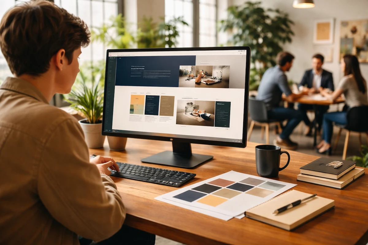
The User Interface Elements That Influence User Behavior Instantly
The best part about understanding user interface design is that you can control exactly where visitors look and what actions they take after visiting. That’s how specific design choices either encourage exploration or trigger immediate exits from your website.
Let’s break down the biggest visual players in those opening moments.
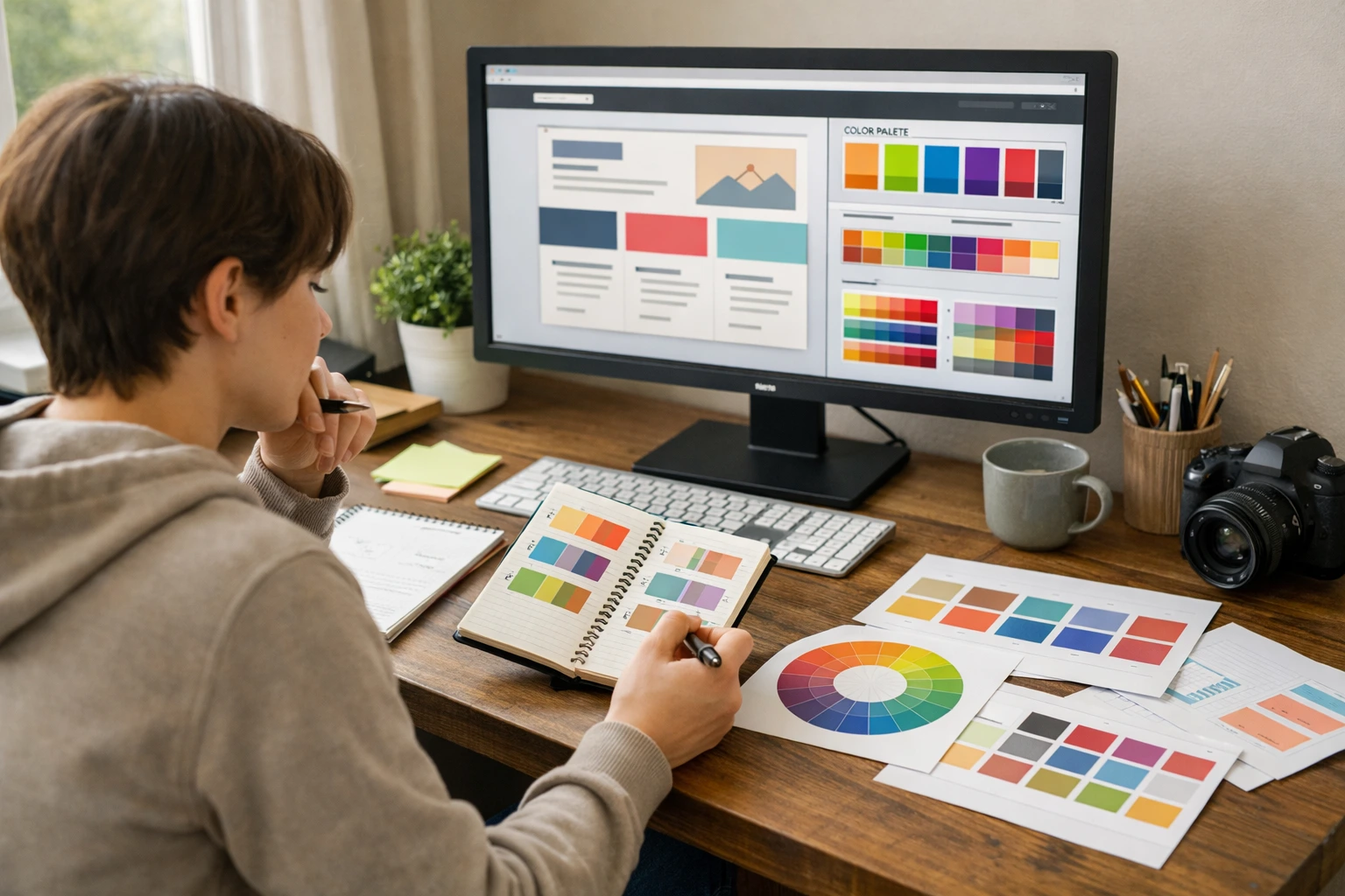
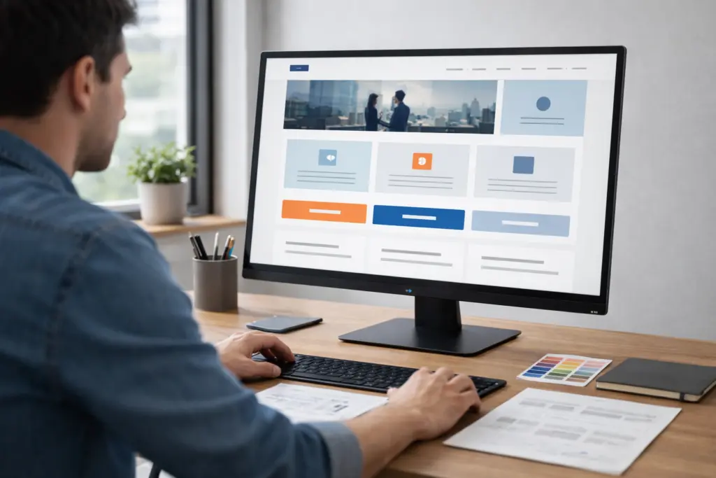
Colour Choices and Visual Hierarchy (What Your Eyes Notice First)
Contrasting colours in buttons draw visitors to calls-to-action while harmonious palettes create visual calm. With these color schemes, the visual impact of colour happens instantly.
Meanwhile, size, position, and spacing show visitors which elements to look at first, second, and third. When users land on your page, their brain automatically follows these patterns.
Too many bright colours compete for attention, which leaves visitors unsure about where to focus. We’ve tested homepages where clients used five different accent colours. The results showed that users left because the cognitive effort was too high to understand (one focal point beats ten every time).
Quick tip: Visitors notice bigger elements before smaller ones. Similarly, items at the top beat items at the bottom always. So, plan your concept and features carefully.
Typography and Whitespace Send Immediate Signals of Trust
Basically, font choices help convey personality. Plus, lean, modern fonts often signal professionalism and reliability. Your typography also tells people whether your site is user-friendly before they read a word.
Adequate whitespace makes content digestible, while cramped text feels overwhelming and untrustworthy. This extra space lets readers take in information without feeling overloaded.
Remember, inconsistent font sizes or styles create visual chaos that makes people bounce immediately. Through our work updating client websites, we’ve watched session recordings where visitors land on pages with three different fonts and leave within seconds. It proves that the visual impact of inconsistent typography kills functionality faster than broken links.
Real Websites That Won (or Lost) Visitors in Five Seconds
Some websites nail first impressions so well that they convert casual browsers into customers immediately, while others lose half their traffic before people even scroll.
Here are real-world examples that illustrate the impact of first-impression design choices:
- The Winners: One e-commerce business changed its homepage hero image with actual product shots. and their conversion rates jumped 23% in the first month. Another company tested button colours and found that a single switch from blue to orange improved conversion rates by 15%.
- The Disasters: A company added sliding banners, pop-ups, and three different calls-to-action above the fold. With this small change, their bounce rate went from 45% to 68% (crazy!). It proves that too much visual noise sends visitors running.
Verdict: Companies that apply optimization based on actual user data see measurable improvements. Besides, case studies across hundreds of websites proved that clear focal points are far better than busy designs.
Meeting User Needs From the Moment They Land on Your Site
Now that you understand which design elements grab attention, the next step is showing visitors exactly what they came to find.
Here’s how to figure out what your visitors actually need to see.
Understanding What Your Audience Actually Wants to See
Different industries require different homepage priorities, from pricing to portfolios to contact information. That’s why things that are usable for one business don’t work for another.
For example, e-commerce sites need product images upfront, while service businesses need trust signals first. An online store that buries its products under three paragraphs of text loses customers fast. Similarly, a consulting business that leads with “Buy Now” buttons before explaining its services also loses customers.
However, user personas help identify which visual elements and content serve your specific audience best. Because when you understand your customers’ preferences, the design decisions become more obvious.
Collect Data About Your Website’s First Impression
You might be wondering how to test what’s working on your own site.
Let’s have a look at what to track:
- Google Analytics shows bounce rates and time-on-page, which reveal whether first impressions even work.
- Five-second tests ask users what they remember after quickly viewing your homepage. This tool gives you unfiltered user feedback about what actually sticks.
- Regular feedback from new visitors provides insights you can’t get from data alone. That’s why ask first-time visitors what confused them or what grabbed their attention.
- Free checker tools help you analyze technical issues that might be killing first impressions before you even get to design.
Bottom line: Tracking these signals together gives you a clear picture of how visitors experience your site at their first glance. Besides, you can make improvements based on your customers’ real behaviour.

Make Those First Five Seconds Count
Your website creates a first impression even without planning. Plus, the visual impact of those opening seconds determines if visitors stick around or bounce back to search results.
But the good news is that once you understand user behavior and what influences those snap judgments, you’re on the right track to making improvements. Sometimes, small changes to your site can create measurable differences in how people respond.
Ready to make your website work harder in those first five seconds? Class Room Encounters helps Australian businesses build sites that grab attention and keep visitors engaged from the moment they land.
So, contact us today if you are struggling to create a positive first impression for your visitors.