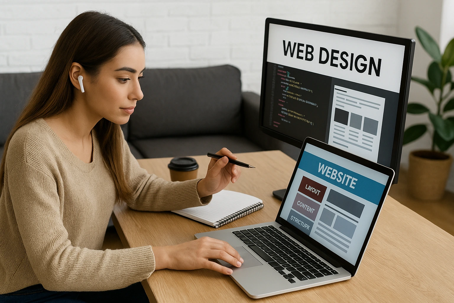
Did you know that 94% of your website’s first impressions are design-related? In fact, visitors judge your site’s clarity within seconds of landing on it. Within that time, if they can’t figure out where to look or what to do next, they bounce.
Your visitors aren’t reading every word on your website. Instead, they’re scanning, skipping, and hunting for what they need. And a simple web design choice helps them find things easily, as it reduces their mental load.
In this article, we’ll break down the layout patterns that can improve understanding. We’ll talk about split screens and F patterns, and how to build design systems that keep everything consistent.
So without any delay, let’s get into what makes a clear website design.
What Makes Website Design Clear?
Clear website design comes from visual hierarchy and clean layouts with plenty of white space. These fundamentals work together to guide users through your content without confusion.
Let’s look at each one and how they improve your website.
Visual Hierarchy Guides the Eye
Ever notice how your eyes land on certain parts of a page first? We call that visual hierarchy. The size, colour, and placement of different elements create a natural flow that runs through the headlines and body content of a page.
Usually, users scan pages in predictable patterns, and good hierarchy matches these natural eye movements (watch someone browse any popular site and you’ll see this pattern play out immediately).
One way of enhancing visual hierarchy is by adding contrast between elements. It can show what’s important and help readers sort through information quickly.
White Space Creates Breathing Room
White space makes your content instantly more readable. Any empty space around elements reduces clutter and improves focus on key messages (nobody enjoys squinting at text crammed edge-to-edge across their screen).
When you give your content ample white space, you’re telling visitors that each piece is important enough to breathe on its own. It also creates visual relationships between related elements without extra design work.
Pro Tip: Add generous margins and padding to make text blocks more inviting to read thoroughly. This trick is so simple, yet it instantly amplifies your site’s readability.
Reading Patterns Affect User Comprehension
Most web users scan the pages for specific details or answers, not settling in for a novel. Your layout choices either support or fight against the natural scanning behaviours people use. When you align your website design with how users actually process information, you reduce friction and speed up comprehension.
Here are some layouts you can consider to make it easier for your visitors.
Split Screen Layout: Balance That Builds Understanding
Split-screen layouts are one of the easiest ways to present two ideas without favouring either. This approach divides attention equally between two concepts or content types, which is perfect when you need to show comparisons or contrasting points side by side.
If you need to show before/after photos, pricing tiers, and feature lists, all fall into place with this layout. You don’t need to reinvent the wheel here.
The clear visual separation between sections lets the users see two distinct areas on screen, and their brain processes each piece of information independently. This helps them understand differences faster than if everything blended together on the page.
As an example, Dropbox’s homepage uses split screens to showcase personal versus business plans side by side. Squarespace also employs this layout when comparing template features, and lets visitors weigh options without jumping between pages.
Magazine Layout: Organised Chaos Done Right
What if you need more flexibility than rigid grids but don’t want total chaos? At that time, magazine layout could combine images and text in varied grid arrangements for visual interest. It suits content-rich sites that need flexibility without looking cluttered or messy.
You can check how Pinterest mastered the magazine layout with its dynamic grid of pins in varying sizes and arrangements. The Guardian’s homepage mixes large feature images with smaller story cards.
This grid-based magazine approach maintains structure while allowing creative placement without losing visual hierarchy. For instance, you can mix large images with smaller thumbnails, stack text columns next to photo galleries, and create breathing room in unexpected spots.
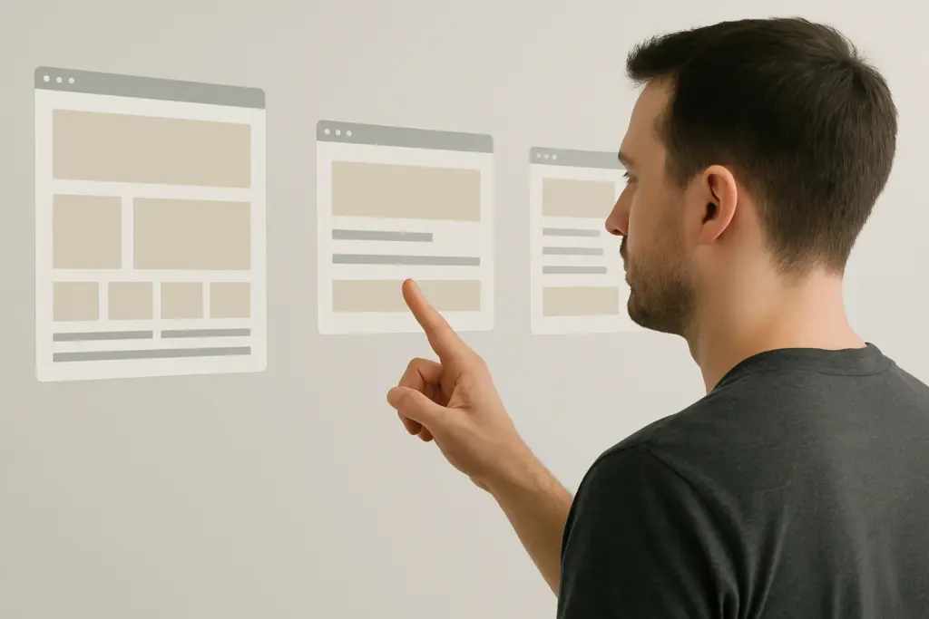
F Pattern Layout vs Z Pattern Layout
The right reading pattern depends entirely on how much text your page contains. Now, before you pick one and run with it, there’s something you should consider.
Both F and Z patterns reflect natural eye movement, but they work for completely different page types. One handles text-heavy content, while the other guides visitors through sparse, conversion-focused pages.
Let’s break down when to use each one.
F Pattern for Content-Heavy Pages
Eye-tracking studies show users spend 80% of their viewing time on the left side of pages. That’s the F pattern in action. Basically, users scan the left side heavily, then horizontally across the interesting content they spot.
This pattern works best for text-heavy sites with multiple paragraphs, explanations, and detailed content that needs reading comprehension. In our web design courses, we show students how left-aligned headings on blog-style pages get noticed first.
That’s why we suggest placing important keywords and headings on the left side, where scanning starts by default. If your website has blog posts and articles, it’ll benefit from the F pattern layout because readers expect paragraphs and detailed information.
Z Pattern for Landing Pages
Z-pattern layouts work best when you want users to follow a specific path. It’s when visitors’ eyes move diagonally across the page, and follow key visual elements in a Z shape.
Usually, landing pages with minimal text work best with Z-pattern layouts. This pattern captures attention at the top left corner, sweeps across to the top right, then diagonally down to the bottom left, and finally across to the right again.
Pro Tip: The smart move is to place your biggest calls to action at the bottom right corner where the Z pattern ends. That’s where eyes naturally land after scanning through your visual interest points.
Take a look at this quick comparison table:
| Category | F Pattern Layout | Z Pattern Layout |
| Best For | Content-heavy pages (blogs, articles) | Minimal-text pages (landing pages, sign-ups) |
| User Eye Movement | Heavy scanning on the left side + horizontal sweeps | Top left → top right → diagonal down → bottom right |
| Why It Works | Matches natural scanning for long text | Guides users through a controlled visual path |
| Ideal Content Structure | Multiple paragraphs, headings, explanations | Clean sections, bold visuals, short copy |
| Placement Strategy | Put keywords & headings on the left | Put major CTA in the bottom right where the Z ends |
| Engagement Style | Supports reading comprehension | Supports conversions and quick decisions |
Different reading patterns suit different page types and content structures across websites. And choosing the wrong pattern can make users work harder to understand your message.

Design Systems Keep Your UI Design Consistent
Design systems are simply sets of rules that keep your interface elements consistent across every page. They establish guidelines for colours, typography, spacing, and component behaviour that apply throughout your entire website design.
This consistency reduces the learning curve. It’s because users don’t relearn your interface with every new page they visit. Plus, well-designed systems make websites feel professional and intentional rather than haphazard.
Predictable patterns mean users spend less mental energy figuring out how things work on your site. Say, repeating button styles, heading formats, and spacing creates familiarity throughout your site.
When your navigation always appears in the same spot, your buttons always look the same, and your headings follow identical style rules, visitors can focus on your content instead of decoding your interface.
We’ve built sites for Australian businesses where establishing a simple design system cut their future update time in half. Basically, no more debates on button colours or heading sizes for every new page.
Time to Simplify Your Website Design
Clear website design comes from understanding how users naturally read and process information. When users can find what they need without effort, they stay on your site longer, trust your content more, and actually take the actions you want them to take.
So focus on clarity, consistency, and user comfort, and your site will naturally perform better across the board. You can start with visual hierarchy and generous white space as your foundation. Once those fundamentals are solid, pick the reading pattern that matches your content type.
If you need help applying these principles to your site, you can visit Class Room Encounters. We teach the fundamentals that make websites work better.