You open your design software to start a project, and before you even set your grid, there’s a pop-up about a new AI tool. Yesterday, it was a layout plugin. Last month, it was a font engine that “designs for you.” It never stops.
If you’ve been feeling like it’s getting harder to keep up, you’re not alone. The tools we use are changing faster than most of us can learn them, and not every update is helpful.
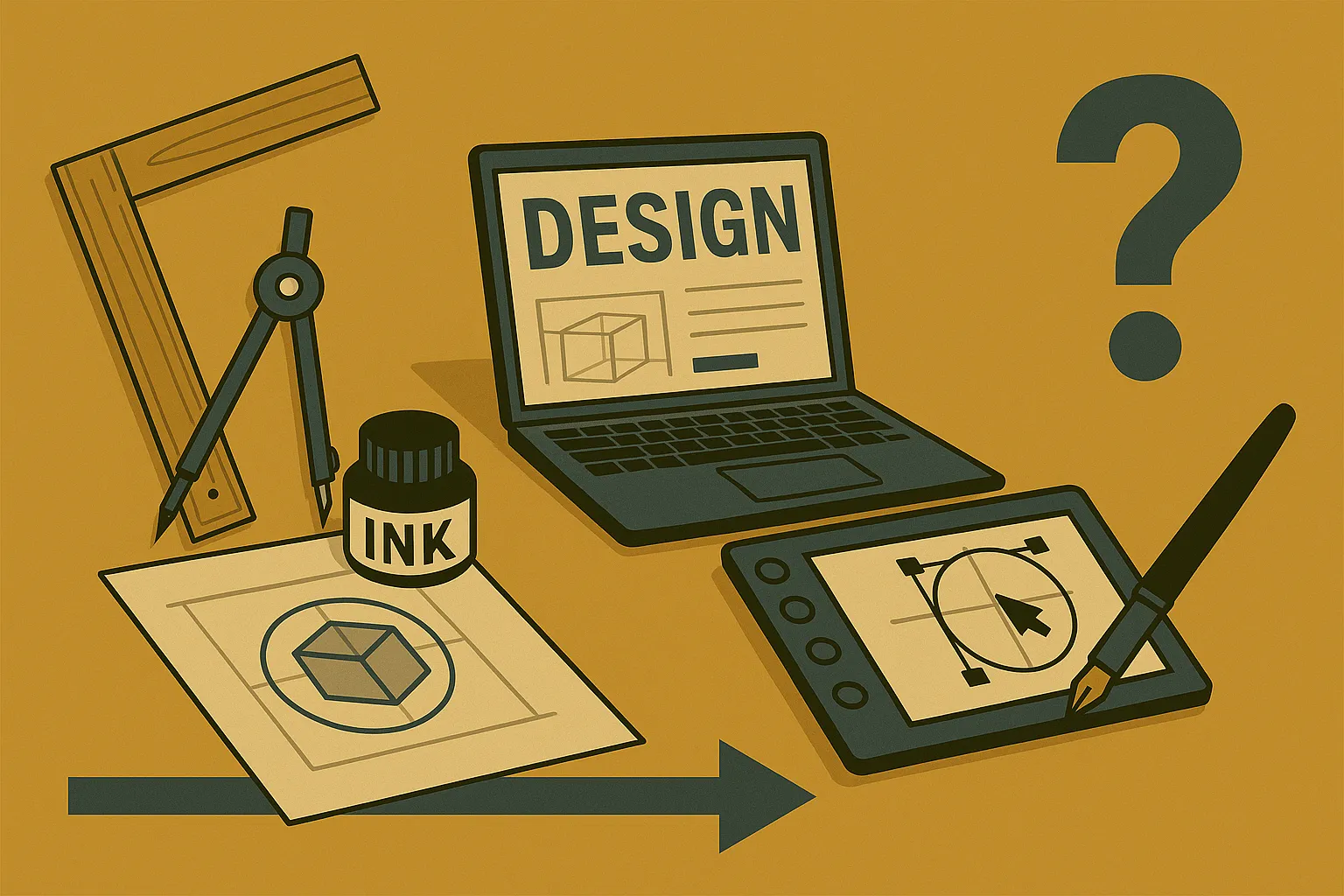
Graphic design tools have developed from rulers and paste-ups into cloud platforms and intelligent software. So, it was a thrilling journey.
This article takes you through that full journey and helps you figure out which tools are actually worth your time.
Take a breath. Let’s slow it down and look at the full picture.
What Did Graphic Design Look Like Before Computers?
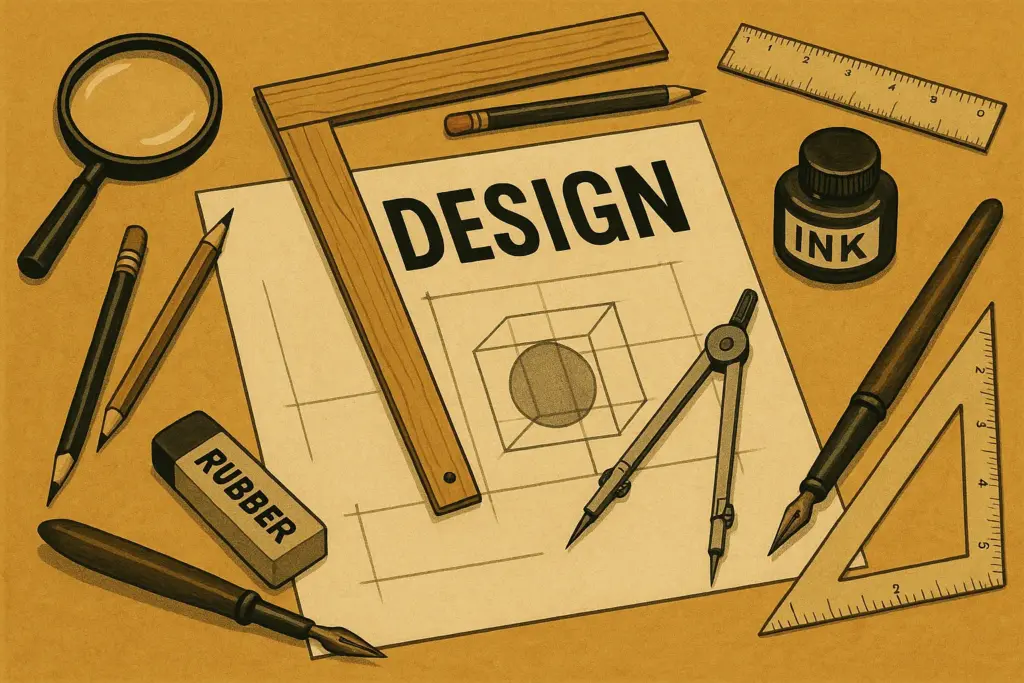
Graphic design before computers was entirely manual. Designers worked with physical tools like rulers, stencils and paste-up boards. Every element was measured, cut and positioned by hand, often after several careful drafts.
Sometimes we used light tables or layout grids to get everything aligned. And what if something needed to change after the layout was complete? You had to take it all apart and start again (it was as messy as it sounds).
How early design worked
Before digital tools, everything was hands-on. You built layouts from scratch using real materials, and each step left a mark, sometimes literally. Here’s how it unfolded over time:
- Symbol-based communication: Early civilisations shared messages with drawings, carvings and symbols. This was where layout thinking really began, deciding where to place visuals so people could follow the story.
- The movable type era: Once Gutenberg introduced the printing press, typography became more than decoration. Designers worked with alignment, spacing and visual flow. That’s when the idea of designing a page really took shape.
- Manual studio work: By the 20th century, studios were packed with tools like T-squares, X-Acto knives and Letraset. You’d cut out blocks of text and images, arrange them on boards and glue them down one by one. A single mistake meant a new board and more time.
That hands-on process shaped how designers approached layout and problem-solving. It wasn’t fast, but it taught a kind of discipline we still respect today. In the next section, we’ll see how desktop publishing reshaped that entire process.
How the Printing Press Revolutionised Visual Communication
We sometimes forget how much the printing press has made the way we work easier than early days. Before it, design was completely unpredictable. But once we had a way to reproduce layouts the same way every time, things got a lot more intentional.
What changed with print design
The printing press made consistency possible, and with that came a need for structure. These changes laid the groundwork for modern layout thinking. Here’s what really shifted during that time:
- Visual order became standard: Designers had to think in terms of spacing, alignment, and structure. That’s when margins, columns, and page balance started becoming part of the design conversation.
- Typography gained structure: Type stopped being decorative and started becoming strategic. Designers began choosing fonts for legibility, tone, and how they worked together across a page.
- Design met production at scale: It wasn’t enough for a layout to look good. It also had to hold up through dozens or even hundreds of printed copies. That required working closely with printers and understanding how different choices would show up on paper.
You’ll see how those habits carried forward when we moved from pasteboards to pixels. In the next section, we’ll look at how desktop publishing introduced a new pace and new expectations and why some of those old principles still matter.
You’ll find that many of them are echoed in these essential design principles.
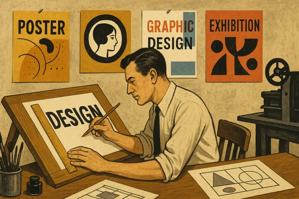
What Tools Did Designers Use Before Digital Software?
If you walked into a graphic design studio in the 1970s or 80s, you’d barely recognise it today. Instead of monitors and keyboards, you’d find glue pots, blades, and layout boards. Every piece of the design was physically assembled, one layer at a time.
How physical tools shaped the process
The tools designers used back then weren’t digital, but they were precise. The way they worked taught discipline, focus, and visual logic. Here are a few of the most important tools from that era:
- T-squares and light tables: These were used to align text and shapes perfectly across a layout. Without them, nothing would line up. Light tables made it easier to trace and adjust elements over multiple layers.
- Stencils and Letraset sheets: Before fonts could be selected with a click, type was either hand-lettered or applied with transfer sheets like Letraset. Each word had to be placed manually (and if it ripped or smudged, you started again).
- X-Acto knives and paste-up boards: Designers would cut out images and text, then assemble them on boards with adhesive. It sounds tedious, and it was, but it also forced you to plan each layout with intention.
What stands out from that era is how hands-on everything was. You could feel the work in your fingertips. And that deep connection to the process shaped how we still think about design today.
When Did Digital Tools Take Over Graphic Design?
Digital tools began reshaping graphic design in the late 1980s, and the change accelerated through the 1990s. When Apple introduced the Macintosh and programs like PageMaker and Photoshop arrived, everything shifted. Design started moving from cutting tables to desktops, quickly and permanently.
You know the mouse you use every day? That’s what I’m talking about. For a lot of designers, this was the first time they created work without scissors or glue. Suddenly, your hands were still doing the work, but now it flowed through a screen.
How the transition changes the game
Designers moved away from paste-up boards and physical elements. What mattered now was learning to design in pixels. This shift felt like a creative boost for some, and a learning curve for others. If you’ve ever made that leap yourself, you’ll understand how different it feels.
- Macintosh introduces design to personal computers
Apple’s early machines gave designers access to user-friendly, visual interfaces. Programs like Aldus PageMaker allowed layouts to be managed entirely on screen. For the first time, you could control fonts and spacing without sending anything to print. - Photoshop puts creative control in your hands
Since its release in 1990, Photoshop offered tools to crop, colour, layer and experiment with a kind of freedom physical materials couldn’t match. The feedback was instant, which changed everything (I still remember the first time I saw someone use layers. It felt like magic). - Adobe builds a creative workflow
As Illustrator and InDesign became part of the Adobe family, designers could now move between projects such as logos, posters, packaging and books without switching tools. This kind of continuity made production faster and gave us room to create without interruption.
We’ll now step into the next evolution. You’ll see how design grows beyond print and adapts to screens of every shape and size.
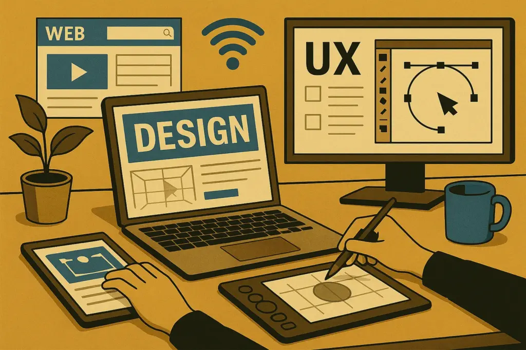
How Web and UX Tools Expanded What Designers Could Do
When graphic design moved from print to screens, everything about the job changed. Layouts became flexible, devices introduced new constraints, and designers began thinking about interaction as much as appearance.
Instead of focusing only on how something looked, we started asking how it would function in the hands of a user.
What changed with screen-based design
You start designing a page and realise it needs to look good on a laptop, a phone, and maybe a tablet rotated sideways. That’s when designers started to think with a new perspective.
They weren’t only arranging elements anymore, they were making decisions that affected how people used what we built.
These are a few of the changes:
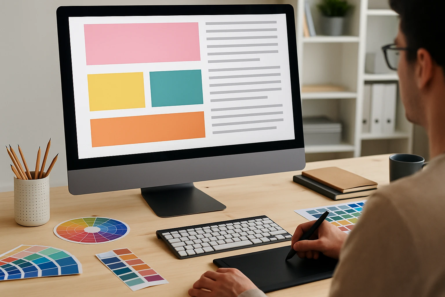
- Design adapts to screens: Digital layouts need to respond to multiple screen sizes and resolutions. Tools like HTML, CSS, Dreamweaver, and Sketch helped designers shape work that performed across devices, not just on paper.
- User experience becomes central: Usability, flow, and interface design became part of the conversation. With platforms like Figma and Adobe XD, collaboration with developers became more fluid and focused on how people use what we create.
- Workflow expands beyond visuals: Designers started working alongside product teams, developers, and content leads. We were no longer polishing the final look. We were helping to build the structure from the beginning. If you’ve ever sat in a UX planning session, you know it’s a completely different kind of creative challenge.
This evolution sets the stage for an even bigger shift. In our breakdown of digital design trends, we cover how this role continues to evolve.
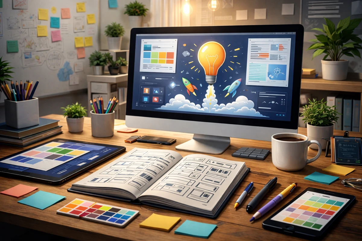
What Role Does AI Play in Today’s Design Tools?
AI in today’s design tools assists with layout suggestions, image editing, content scaling, and even colour palette generation. It helps designers move faster and automate repetitive tasks, but still requires human judgment to guide the creative direction.
For example, you start adjusting a layout and notice the software is already a few steps ahead. It recommends a fix, fills in missing details, or offers a ready-made version.
This is the role artificial intelligence is playing, not as a separate tool, but as part of the environment we work in. Some of it speeds things up. Some of it still feels like it’s learning.
Where AI is making an impact
AI has already streamlined the designer’s working process. Some features of AI save time, while others push creative boundaries. The tools below reflect the ways AI is currently being used by designers every day.
- AI-assisted editing and layout tools: Adobe’s Generative Fill and Canva’s Magic Design help automate edits, fill in image gaps, and even build initial layouts. These tools can speed things up considerably, especially on high-volume projects.
- Design suggestions and automation: Platforms like Khroma use AI to recommend colour palettes based on your preferences. Some tools even predict typographic pairings. It’s like having a second set of eyes that never gets tired (though sometimes it still misses the mark creatively).
- Smart content scaling and versioning: Tools that support AI-driven resizing and multi-platform formatting help streamline how assets are created. This is especially helpful when you’re designing for dozens of screen sizes or languages at once.
Some of it speeds things up. Some of it still feels like it’s learning. You’re still the one making the decisions.
So yes, AI can help. But it depends on how and where you use it. That’s why choosing the right tools for the right job still requires a human. But how do you know what’s right for you? We’ve covered that next. Keep reading.
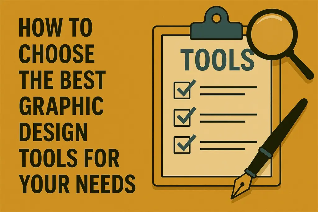
How to Choose the Best Graphic Design Tools for Your Needs
We want to help you choose the right tools based on years of working in design environments.
The right software can reduce mistakes, speed up your process and help you stay focused on the work rather than the interface. Instead of bouncing between apps or feeling confused about your setup, you can focus on delivering better work with less stress.
Where to start when choosing tools
Think of your tools as part of your process. You want something that fits how you work, not something that constantly interrupts it. These steps can help you narrow things down:
- Start with your workflow: Are you focused on branding, print, digital content, or web design? Once you’re clear on that, it becomes easier to pick something that supports those outcomes. Canva is strong for simple layouts. Adobe is better suited for layered, multi-step projects.
- Pick based on your current experience: New to design? Try something that teaches as you go. Canva and Gravit are accessible and give you a good foundation. More experienced? Affinity or Adobe Creative Cloud offer deeper control (and switching too soon can slow your learning instead of helping it).
- Build a stable toolkit: There will always be a new tool making the rounds online. That doesn’t mean it fits your workflow. It’s smarter to get really comfortable with a few programs that support your work well. You can explore new ones when you have room to experiment.
Next, we’ll take a look at what’s ahead and how to stay flexible without losing focus.
Stay Focused as Design Tools Keep Upgrading
You try to stay on track, but then a new tool shows up in your feed and promises to fix everything. You weren’t looking for it. Now it’s in your head, because it’s trending now. That’s how the problem starts.
It’s pleasing to click, test, and explore new tools. I’ve done it too. But if we’re being honest, most of those tools don’t solve anything urgent. They pull your focus, shift your priorities, and leave you wondering where the time went.
So, we recommend sticking with the software that helps you finish strong. Let everything else wait its turn.
If you’re building your skills and want guidance that stays useful no matter what version drops next, take a look through Classroom Encounters. Take what fits the best and move forward.