You wouldn’t lock the front door of your business to people with mobility issues, so why let your website do it? Yet that’s exactly what happens when sites aren’t designed with accessibility in mind. Something as small as light grey text or missing image descriptions can significantly impact how accessible your site feels.
An accessible website works better for everyone. Clear navigation, simple layouts, and faster actions make your site more inviting and more effective.
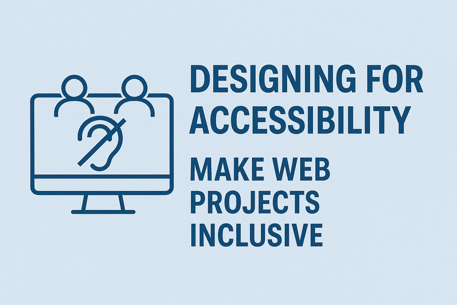
This post is your introduction to accessible web design. We’ll break down what accessibility means, how the WCAG guidelines work, and what you can do to start designing with everyone in mind. It’s simpler than you think, and the impact is greater than you realise.
Let’s start by clearing up what accessibility means for websites.
What Accessibility Really Means in Web Design
Accessible web design means making sure everyone can use your site, not just the average user. It removes barriers so people with disabilities can use, understand, and interact with your content just as easily as anyone else.
When you design with accessibility in mind, everyone wins. Take kerb ramps, for instance. They were made for wheelchairs, but they also help parents with strollers, delivery workers, and anyone rolling a suitcase.
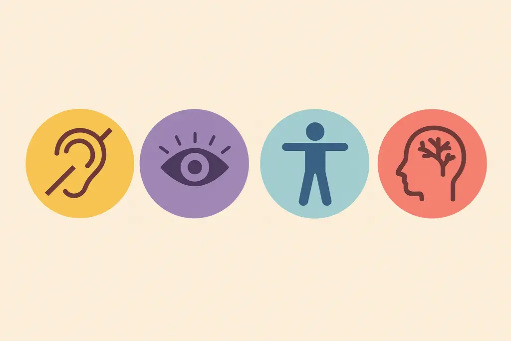
Let’s look at the four most common categories of accessibility needs:
Visual Impairments
Websites that focus only on visual design can create real issues for people with vision difficulties. Light grey text on white might seem stylish, but for someone with low vision, it can be nearly impossible to read. And if colour is the only way to tell buttons apart, people with colour blindness may not know which one to click.
These issues show how relying just on visuals isn’t enough. Screen readers help blind users access websites, but they rely on accurate alt text to describe images. If that’s missing or too vague, users miss out. A banner with a key message or link that isn’t labeled properly won’t be noticed and that could mean missing something important.
Hearing Impairments
Websites that use a lot of audio without offering visual options can leave out users who are deaf or hard of hearing. It becomes even more frustrating when videos play automatically with no captions, or when podcasts share important info without a written transcript.
Sound cues alone don’t work for everyone. If a site signals a payment went through with just a chime, and there’s no visible message, users who can’t hear that sound may be left wondering what happened, or worse, try to pay twice.
Motor Disabilities
People with limited mobility or trouble with precise movements often use keyboards, head pointers, or voice commands to navigate websites. If a site relies only on mouse actions like menus that open on hover or forms that require dragging, these users might have trouble getting around or completing tasks.
Small clickable targets, including tiny close buttons or tightly packed menu links, can make things frustrating for people who have trouble with precise movements. If pop-ups can’t be closed using a keyboard, users might get stuck and won’t be able to keep using the site.
Cognitive Differences
Users with cognitive differences such as ADHD, dyslexia, autism, or memory-related conditions often struggle with websites that are cluttered or overly complex. A dense or inconsistent layout increases mental effort and makes it harder to find and process information. Unfamiliar icons, unexplained abbreviations, or non-standard patterns like a form submit button labelled “Go!” instead of “Submit” can cause confusion or delays.
Animations or flashing content can be overwhelming or triggering, especially for users with sensory processing challenges. Auto-playing carousels or unexpected motion effects can interrupt focus or cause distress, often leading to abandonment of the site.
When these barriers aren’t addressed, they can make your website confusing, frustrating, or even impossible to use for many people.
So, how do you build a more accessible design into your process? Start with a framework like WCAG, which we’ll explore in the next section.
A Beginner’s Guide to WCAG for Web Accessibility
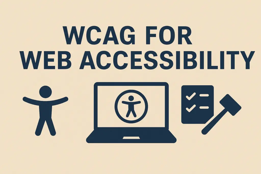
If you’re building a house, you follow building codes. If you’re designing a website, WCAG is your code for accessibility. The Web Content Accessibility Guidelines are an internationally recognised standard that helps web designers and developers create inclusive experiences that work for everyone. These guidelines are the foundation for thoughtful, user-focused design.
To understand WCAG, start with its four key principles. These are often referred to by the acronym POUR. They provide a practical framework to design websites that are accessible and easy to use for a wide range of people.
Perceivable
First, users need to be able to see and understand the content. If important information depends only on color or is shown in images without descriptions, some people won’t be able to access it.
To support all users:
- Add alt text to all meaningful images so screen readers can describe them.
- Avoid using colour as the only way to convey meaning (e.g. “click the red button” is unclear for someone with colour blindness).
- Provide captions for videos and transcripts for audio content, supporting users with hearing impairments or those in sound-sensitive environments.
Operable
Next, your website needs to be easy to use. Everyone should be able to interact with all parts of your site, no matter what device or method they’re using.
This means:
- Making sure all menus, buttons, and forms can be used with a keyboard alone.
- Giving users control to pause or stop moving items like carousels and auto-scrolling text.
- Avoiding time-limited content or flashing visuals that could trigger discomfort or seizures.
Understandable
A site can work well but still frustrate users if the content is hard to follow. That’s why making things clear and easy to understand is just as important.
You can help users by:
- Writing in clear, concise language and avoiding unnecessary jargon.
- Including labels and instructions for all form fields.
- Keeping the layout consistent across pages supports easier navigation and reduces cognitive load.
Robust
Finally, your site needs to be strong enough to work smoothly on different devices and with various assistive tools. Accessibility isn’t the same for everyone, and many people use different ways to access your content.
To improve robustness:
- Use semantic HTML and follow web development best practices.
- Test with screen readers, browser extensions, and accessibility tools.
- Avoid experimental features that may not function reliably across devices or platforms.
Focusing on these four areas makes your website more accessible, stable, and easy to use for everyone. This helps create a friendlier experience for all visitors.
Understanding WCAG Conformance Levels
WCAG breaks down improvements into three levels of conformance to help organisations focus on what matters most.
- Level A sets out the minimum requirements to remove major barriers. This can include providing text alternatives for images and ensuring basic keyboard navigation.
- Level AA is the most commonly adopted standard and strikes a practical balance between effort and impact. This could mean making sure colours have enough contrast and navigation stays the same on every page.
- Level AAA offers the highest level of accessibility, often used in government and specialist services. This may involve providing sign language interpretation for videos or enhanced support for cognitive accessibility.
Most websites aim for Level AA compliance, as it covers key accessibility needs without being too hard to implement.
Grow Your Website’s Accessibility Over Time with WCAG
If WCAG feels overwhelming, that’s completely normal. It’s a detailed framework and can take time to understand and apply. You can gradually build accessibility into your site without needing it to be perfect from the start.
Think of WCAG not as a rigid checklist but as a guide you can grow with. Start by adding alt text to images, improving color contrast, and making sure your site works with just a keyboard. Taking these steps gradually makes your website easier for everyone to use.
Now that you understand the structure and goals of WCAG, let’s look at how to apply those principles in your design work.
Practical Steps to Design with Accessibility in Mind
Making your website more accessible involves small, intentional steps that gradually improve the experience for more people. Focusing on clear headings, good color contrast, keyboard navigation, and descriptive alt text can improve your site for everyone without needing a full redesign.
Let’s walk through these practical steps that can immediately improve the accessibility of your site, no matter where you’re starting from.
1. Use Proper Heading Structure
Headings help organize your content and make it easier to navigate, especially for people using screen readers. Use a clear order: start with one <h1> for the main title, then <h2> for main sections, and <h3> for smaller subsections. For example, a product page could use <h2> for features and <h3> for details about each one. Don’t skip heading levels, as this can confuse both readers and assistive tools.
2. Check Colour Contrast
Once your structure is set, focus on visibility. Text that blends into the background can be hard to read for people with low vision or colour blindness. For instance, soft pastel colors like light pink on a white background may seem gentle but are often hard to distinguish. Use tools like the WebAIM Contrast Checker to test colours and make sure your site meets the recommended contrast levels.
3. Add Descriptive Alt Text
Making visual content accessible is just as important. Alt text helps people using screen readers understand images. Instead of generic phrases like “image1,” describe what the image shows.
For example, “a teacher helping a student use a magnified computer screen.” This adds meaning and context. For purely decorative images, use alt=”” so screen readers skip them.
4. Ensure Keyboard Accessibility
Not everyone can use a mouse, so your site should work well with just a keyboard. Try using the tab key to move around your site. You should be able to reach all clickable items like links, buttons, and forms in a clear, easy-to-follow order. If you can’t see where you are or get stuck somewhere, it’s a sign something needs fixing.
5. Label Forms Clearly
Forms can be tricky for many users, so clear labels are really important. Make sure each label is easy to see and placed above its field. This helps everyone understand what to enter and works better with screen readers. Don’t just use placeholder text because it disappears when someone starts typing, which can be confusing.
6. Use Readable Fonts and Sizes
After you’ve set up your layout and interactions, pay attention to typography for easier reading. Pick simple, clean fonts and avoid using fancy fonts for the main text. Use relative font sizes like em or rem instead of fixed pixels. These units let text scale smoothly when users adjust font size in their browsers, keeping your design intact.
7. Avoid Flashing or Auto-Play Content
Now think about the moving parts on your site. Motion can catch attention but also cause discomfort. Auto-play videos or flashing banners might confuse users or even cause symptoms like nausea or seizures. Make sure users have control by letting them decide when to play content and giving options to pause or stop animations.
8. Provide Options Where Possible
Finally, giving users choices makes your site easier to use. Features like “skip to content” links, font-size adjusters, or toggles to reduce motion help more people navigate comfortably. These simple options make the site better for everyone, not just those with special needs.
These changes might look small, but they show you’ve really thought about your visitors. Most people won’t even notice them, but for those who need them, they make a huge difference. A simple tweak could be the reason someone can read your content, finish a purchase, or use your site without trouble.
After these steps are in place, it’s time to test them and make sure they are doing what they’re meant to do.
Best Practices for Testing and Improving Accessibility
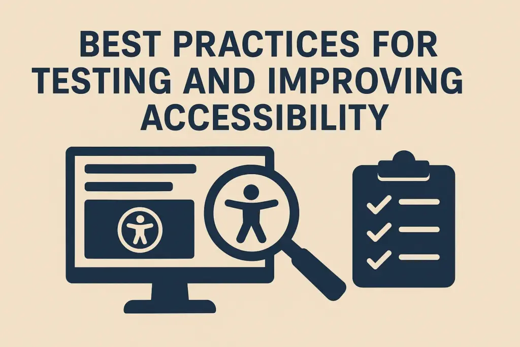
You’ve made improvements, great! Now it’s time to check that they actually work. Accessibility takes ongoing effort with learning, testing, and improving. The best way to start is by looking at your website through the eyes of someone who relies on accessibility features every day.
Here are some easy ways to test your site and make sure your changes are really helping everyone.
Navigate Without a Mouse
Use only your keyboard to navigate your site. Press the tab key to move through links, buttons, and form fields in order. When tabbing through a form, the focus should move step-by-step without jumping unpredictably. A clear focus indicator, like a border or outline, shows users where they are on the page.
If you notice any part of your site can’t be accessed using only the keyboard, that’s a clear sign of a barrier for users with motor impairments or those using assistive switches.
Use a Screen Reader
Screen readers convert digital content into speech or braille, making it accessible to users who are blind or have low vision. Try a free tool like NVDA (Windows) or the built-in VoiceOver on Mac.
Listen to how your content is read aloud. Ask yourself:
- Are headings announced in the correct order?
- Do links make sense out of context (e.g. avoid using “click here”)?
- Do images have helpful descriptions?
Even just ten minutes with a screen reader can help you spot navigation or content issues you might have missed otherwise.
Run Automated Accessibility Scans
Automated tools are a great way to get started and catch common issues early on. Here are a few useful ones to try:
- WAVE by WebAIM visually highlights accessibility issues such as missing alt attributes, poor contrast, or incorrect heading levels.
- Lighthouse, available in Chrome DevTools, gives your page an accessibility score and provides actionable suggestions for improvement.
- axe DevTools, a browser extension, detects issues like ARIA errors or unlabelled buttons and explains how to fix them.
These tools are fast and informative, but they should not replace manual or real-user testing.
Conduct Real User Testing
Automated tools can only identify about 30 to 40 percent of accessibility issues. The most valuable feedback often comes from real people who rely on assistive technologies or have first-hand experience with accessibility barriers.
Invite users to try specific tasks on your website, such as completing a form or finding contact information. Observe where they hesitate, struggle, or need workarounds. Their insights provide context that automated tools simply cannot offer.
Real user testing also builds empathy and highlights the real-world impact of your design decisions.
Make Testing an Ongoing Practice
Accessibility isn’t something you fix and forget. As your website changes, like updating content, adding new features, or redesigning, new issues can come up.
Make accessibility testing part of your regular website checkups. Even small changes, like tweaking a color or shifting a layout, can impact how people use your site. Staying on top of it helps keep your site easy to use and welcoming for everyone.
These testing strategies help make sure your accessibility improvements are meaningful, effective, and built to last.
Why Accessibility Is Everyone’s Responsibility
You now understand the what, why, and how of accessible web design. The final question is simple: will you take action?
Accessibility is a shared responsibility. As a designer, developer, content creator, or business owner, your choices affect who can use your site. Every detail, from font size to form layout, can create barriers or help remove them.
You can take your first step today by checking your color contrast, improving alt text, or trying to navigate your site using only a keyboard. These simple actions may seem small, but they truly make a difference for real people.
It’s steady effort, not perfection, that drives progress in accessibility. Keep testing, learning, and listening to feedback. That’s how better websites get made and how the web becomes more inclusive for everyone.