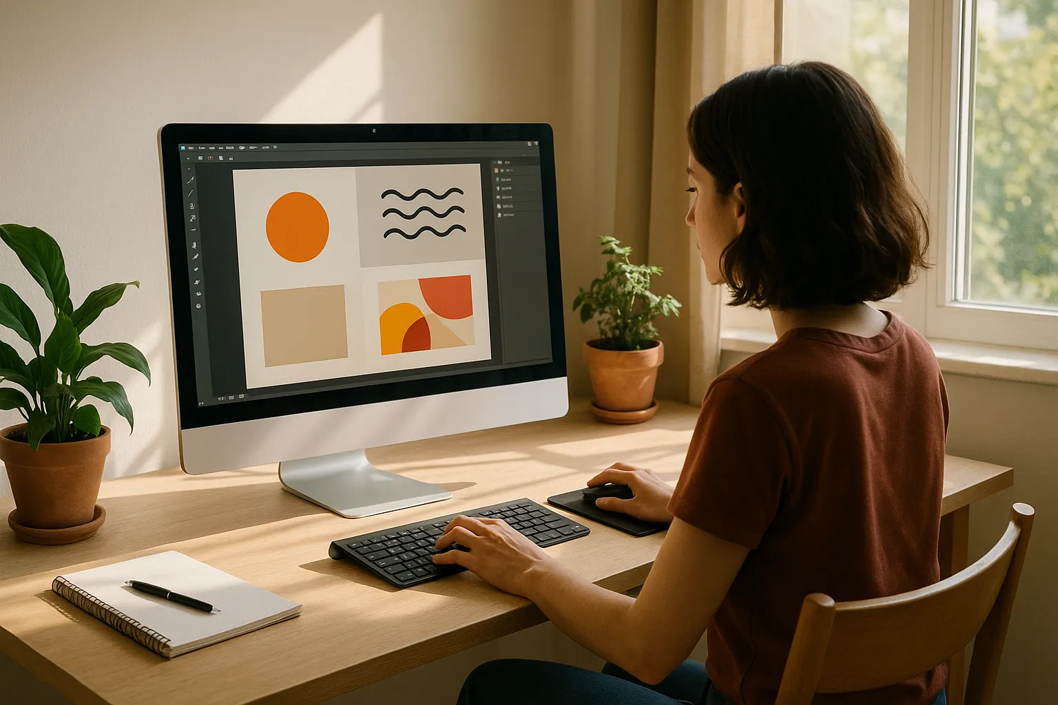
New designers should start by mastering the basics like layout, colour, typography, and visual hierarchy before learning advanced tools.
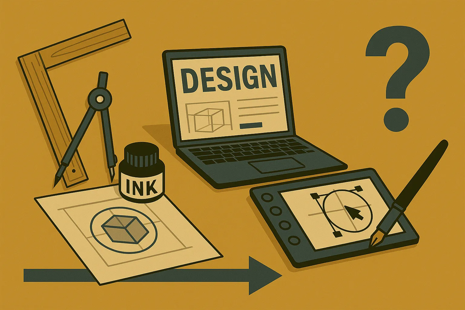
Many beginners jump straight into Photoshop or Illustrator, thinking the software will do the heavy lifting. But the truth is, fancy digital tools won’t save a design that lacks balance, contrast, or clear visual hierarchy.
That’s why this guide covers the beginner design priorities worth focusing on. You’ll learn how to build strong foundation skills, why graphic design history is worth knowing, and many more interesting facts about design and art.
Let’s start with what a beginner design priority should look like.
What Should Beginner Design Priorities Actually Look Like?
Beginner design priorities should centre on visual principles like balance, hierarchy, and contrast rather than software skills. A lot of new designers spend months learning tools without understanding the ideas that make designs work.
However, learning the “why” behind graphic design helps you make better decisions. Because design software changes and updates every few years, but strong foundation skills always stay constant in your career as a graphic designer.
So before you download another tutorial on filters and effects, let’s look at what actually deserves your focus first.

Why Design Foundation Skills Beat Fancy Software
Your foundation skills are what actually help you create designs that look good, while the software just helps you put them together.
The foundations work in every program, every project, and every design job you’ll ever have. And a designer who understands balance and contrast will outperform someone who only knows which buttons to click (we’ve all rage-quit a tutorial at some point).
Most importantly, clients care about results, not which program you used. So learning them first saves you heaps of time when switching between different design programs down the track.
The Early Graphic Design Focus That Pays Off
Ever wonder why some designers grow fast while others stay stuck? It’s because they focus on design basics, like hierarchy, alignment, and proximity. These basics help you communicate clearly with your audience, which is the whole point of creating visuals.
That’s why getting good at simple compositions first builds confidence. It also makes advanced techniques easier to learn later. When you understand how elements work together, adding fancy effects becomes part of your style.
Design Principles: Your First Real Toolkit
Design principles are the basic rules that teach you how elements sit together on a page, screen, or any visual format. Think of them as grammar rules, but for visuals (skip this, and your portfolio will show it).
So what are these principles exactly? Take a look at some of the main concepts and their purpose:
- Balance: Balance keeps your visuals from feeling lopsided. You can go for symmetrical balance, or try asymmetrical balance for something more dynamic and interesting. The choice depends on what mood you want to create.
- Contrast: Using contrasting colours, sizes, or shapes draws attention to the most important parts of your design. Without it, everything blends together, and nothing stands out.
- White Space: White space (also called negative space) gives your design room to breathe. Beginners often try to fill every corner, but that’s a mistake. Leaving empty space makes your content easier to read.
- Focal Point: This is where you guide the viewer’s eye first. Every strong design has one clear focal point that grabs attention before anything else. If people don’t know where to look, your message gets lost in the noise.
- Typography: How you align text affects readability more than most beginners realise. Good typography can make average visuals look polished, while poor choices can ruin an otherwise solid layout.
Once these design principles become your second nature, your process will speed up by default. You’ll spend less time second-guessing and more time creating visuals that execute your message with simplicity and purpose.
Understanding Design Elements from Ancient Times to Now
Believe it or not, humans have been using visual communication for nearly 40,000 years. It all started with cave paintings and carved symbols. These early forms of images helped people share stories, pass down knowledge, and communicate across generations.
But why are we bringing design history at all? Well, understanding graphic design history helps you spot patterns and borrow ideas from art movements that influenced all modern aesthetics. The tools might have changed, but the ancient principles stuck around.
And that knowledge makes you a stronger designer in the long run. Let’s take a look.
The Industrial Revolution
The Industrial Revolution was a significant milestone in graphic design history. New technologies like the printing press and woodblock printing allowed the production of printed materials on a larger scale.
Lithography also introduced itself during this period. Because of that, businesses could create logos, posters, advertisements, and even book covers.
And for the first time in history, visual communication became accessible to the public and not just the wealthy. These technologies are the basis for everything we see today.

Art Nouveau, Art Deco, and the Modern Era
Knowing these art movements gives you a vocabulary for styles you’ll see referenced everywhere in modern design work. Let’s break them down so you know what to look for.
- Art Nouveau: This style features organic lines, flowing forms, and botanical illustrations. It originated as a reaction against industrial monotony to favour handcrafted design and natural beauty. You can spot it in vintage posters, jewellery, and decorative architecture from the late 1800s.
- Art Deco: You can see Art Deco influence in everything from building facades to product design. This style is mainly bold geometric shapes, clean lines, and decorative patterns. Some notable examples are travel posters, furniture, and even parts of Central Park’s design elements.
- The Modern Era: Paul Rand is one of the most famous designers of this period. He took inspiration from both of the previous movements in his logos and visuals. His work proved that understanding history helps you create something fresh instead of something that feels copied.
In short, learning these styles teaches you how to reference the past without ripping it off. And that’s where skilled designers pull ahead of the rest..
What Every New Graphic Designer Should Practice First
New graphic designers should practice layout, hierarchy, and feedback skills before moving into complex software features.
Here are some practices you can start with.
Recreating Designs
Through our practical knowledge working with beginners, we’ve found that recreating designs you admire is one of the best exercises. For that, you can pick a poster, website, or logo you love and try to rebuild it.
Over time, you’ll start noticing how experienced designers use spacing, alignment, and visual weight. It’s similar to learning a language by copying sentences before writing your own.
Limiting Colour Palettes
When you practise with contrasting colours and simple colour schemes, it helps train your eye. We recommend limiting your colour palette to two or three options. This forces you to practice restraint and make purposeful choices with your elements.
You’ll also get better at using white space and negative space when you’re not drowning in options.

Giving and Receiving Feedback
Feedback is another underrated way you can learn. Try giving and receiving honest opinions on your work. Especially if you want to become an art director or a freelance web design specialist, because design rarely grows in isolation.
Getting comfortable with critique early saves you from surprises later when clients or teammates share their thoughts.
Squint Test to Sharpen Your Eye
Simple exercises like the squint test can help train your visual instincts quickly. This test is exactly what it sounds like. Squint at your design and see if the hierarchy still holds up when details blur together. If everything blends into mush, your focal point needs work.
Pro Tip: Start with black and white compositions to learn hierarchy first. Then slowly add colour, images, and typography as you grow. Websites like Dribbble and Behance are full of example projects you can study and learn from.
Build the Foundation Every Graphic Designer Needs
Ultimately, strong foundation skills outdo advanced software every single time. This is all the more reason to focus on the basic design principles like balance, contrast, hierarchy, and alignment before going for flashy effects.
Always remember that these basics help you communicate clearly and grow as a graphic designer. They’re the reason some designers keep developing while others stay stuck.
So, start with simple exercises and learn how elements work together before worrying about which program to use. The advanced tools will automatically click into place once your fundamentals are solid.
And if you’re looking for more practical resources to support your web design practices, check out Class Room Encounters. Join us to explore more design exercises that build your confidence over time.