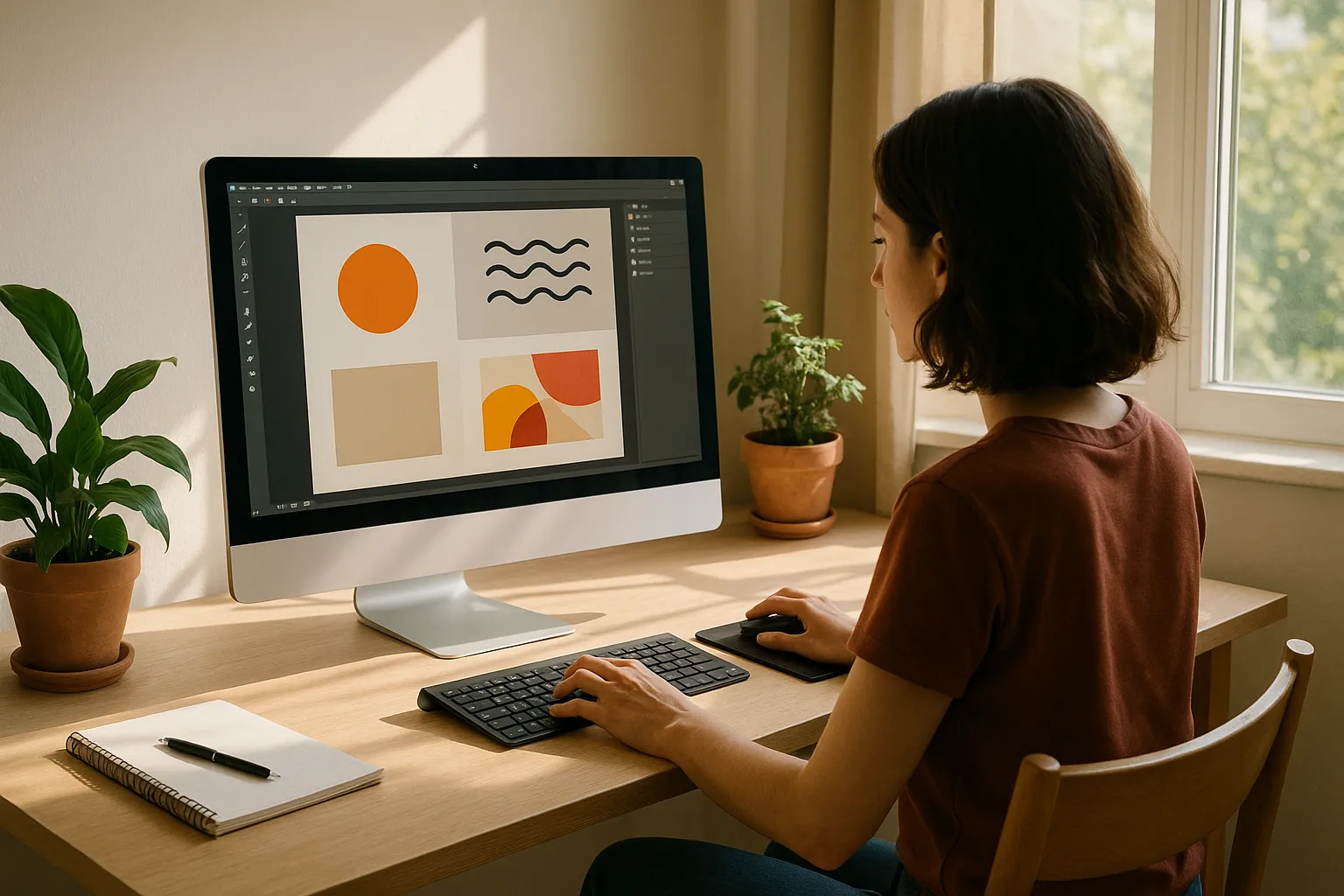
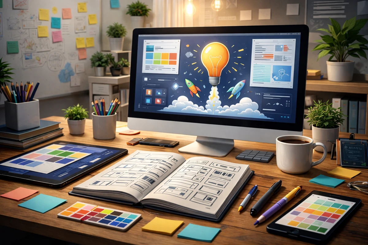
Graphic design refers to more than just making things look good. It is about creating clear communication through visual elements. But for many students, learning how to combine different elements into a cohesive layout feels like an overwhelming puzzle.
Without a structured approach, designs can become cluttered and confusing. That is where the necessity of learning graphic design comes in. These guidelines help you create a sense of order, guide the viewer’s eye, and ensure your work is both functional and aesthetically pleasing.
If you’re designing for a school project or building your portfolio as a new graphic designer, these principles matter. Learn how to use them well, and you’ll feel more confident creating visuals that look great and get results.
1. Balance: Finding Visual Stability
Balance is one of the most important elements in any design. It involves distributing graphic elements evenly across the layout to create harmony. When the balance is perfectly done, it makes your design stable, organised and intentional. When ignored, it can lead to visual confusion.
There are two main types of balance:
- Symmetrical balance involves mirroring elements on either side of a central axis. It is great for creating formal, clean designs.
- Asymmetrical balance uses different elements to achieve visual equilibrium. It is often used to add energy and movement to a composition while still maintaining cohesion.
In both cases, the goal is to create a sense of equilibrium. For students, learning when to use each type can help in everything from posters to digital media. Using a grid system can be especially helpful in achieving a consistent layout and distributing visual weight properly.

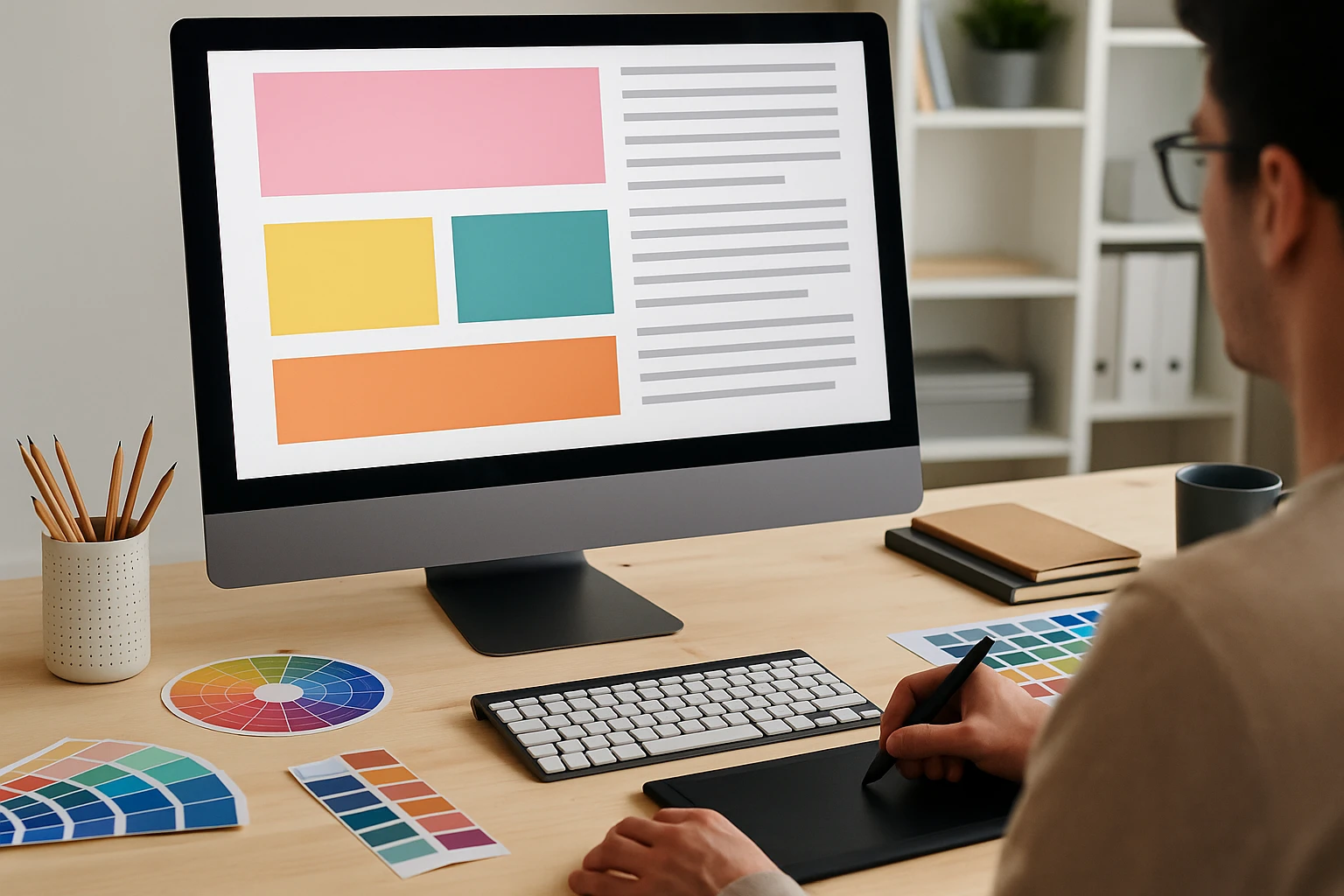
2. Contrast: Directing the Viewer’s Attention
Contrast is what makes a design interesting. It helps you draw the viewer’s attention to the main information and makes your content easier to read and understand. Using contrasting colours, shapes, sizes, or fonts adds visual interest and stops your design from feeling flat.
For example, placing a bold, dark heading on a light background immediately signals its importance. Or, mixing thick and thin font styles can help differentiate headers from body text. Even spacing plays a role. More space around an element can increase its visibility and emphasis.
Using contrast strategically also improves your ability to effectively communicate with your audience. If everything looks the same, nothing grabs attention. But when contrast is used well, you create a clear pattern that guides the reader through your work and reinforces your message.
3. Repetition: Consistency Creates Recognition
Repetition is a powerful design principle that often goes unnoticed. It involves using repeated elements such as fonts, colours, icons or shapes to build cohesion throughout your design. The goal is to ensure consistency so your design feels unified and easy to follow.
Think of repetition as the visual rhythm of your layout. Just like a catchy chorus in a song, repeated elements help reinforce your message. This is especially useful for building brand recognition and visual identity. If applied properly, it creates flow and helps the viewer understand what to expect from section to section.
A great example is Canva’s brand kit tools, which show how repeating colours and typography build a strong, recognisable aesthetic across multiple designs. Students working on group projects or personal portfolios can benefit greatly from learning how to establish and repeat visual patterns to maintain clarity.
Repetition also plays a big role in accessibility. For viewers with visual impairments, repeated layout cues and consistent formatting can improve readability and navigation. This is a principle supported by the W3C’s Web Accessibility Guidelines.
4. Hierarchy: Controlling What They See First
Hierarchy in graphic design is about guiding the viewer’s eye through your content in the order you intend. It answers the question: what should they notice first, second and last?
You create a hierarchy through variations in font size, colour, spacing and placement. For example, a large, bold title will naturally attract more attention than smaller body text. Subheadings, pull quotes, or call-out boxes also help organise your layout, directing attention to the most important elements.
Understanding hierarchy is essential for students designing posters, brochures or social media graphics. If everything on the page has the same visual weight, nothing stands out, and your message may get lost.
This principle also applies to digital content. A useful reference is Adobe’s guide to visual hierarchy, which explains how contrast, alignment and spacing work together to emphasise content. Knowing how to control visual flow ensures your design communicates clearly and effectively, especially when combined with other principles like contrast and proximity.
5. Proximity and Alignment: Creating Order and Clarity
Proximity and alignment work hand in hand to bring structure and clarity to your design. These are two of the most overlooked but essential graphic design principles, especially for beginners trying to create clean, readable layouts.
Proximity is all about grouping related elements. When similar content is placed close together, it forms a visual unit. This helps viewers understand relationships between text, images and icons without needing extra explanation. For example, placing a heading right above a paragraph shows they belong together. On the other hand, if the same heading is far away or misaligned, it creates confusion.
Alignment ensures that every element has a visual connection to another. This doesn’t mean everything must be centred, but rather that the design follows a consistent, intentional path. Aligned content makes layouts easier to scan, helping the reader absorb information more naturally.

To practice both of these principles, try working with a simple grid system. Grids help maintain a structured approach, allowing you to line up important elements and balance space effectively. You’ll quickly notice how a few small tweaks in spacing or alignment can instantly elevate your design from cluttered to clear.
6. White Space: Let Your Design Breathe
White space, also known as negative space, is the area around and between the elements in your design. It may seem empty, but it plays a powerful role in shaping how your layout feels and functions. Used well, white space can create a sense of balance, draw attention to key content and make your design look more aesthetically pleasing.
One of the biggest mistakes beginners make is filling every inch of space. This often leads to visual overload and weakens the impact of your most important elements. Instead, white space allows those elements to stand out by giving them room to breathe. Think of it as a pause between ideas, helping guide the viewer’s eye through your work.
In fact, many high-impact designs rely on white space to emphasise simplicity and elegance. Consider looking at Apple’s website for inspiration. Their layouts are clean, minimal and highly readable, all because of the smart use of space.
White space is not wasted space. It enhances visual communication, improves readability and contributes to a more user-friendly experience. Learning to embrace it will sharpen your ability to design with confidence and restraint.
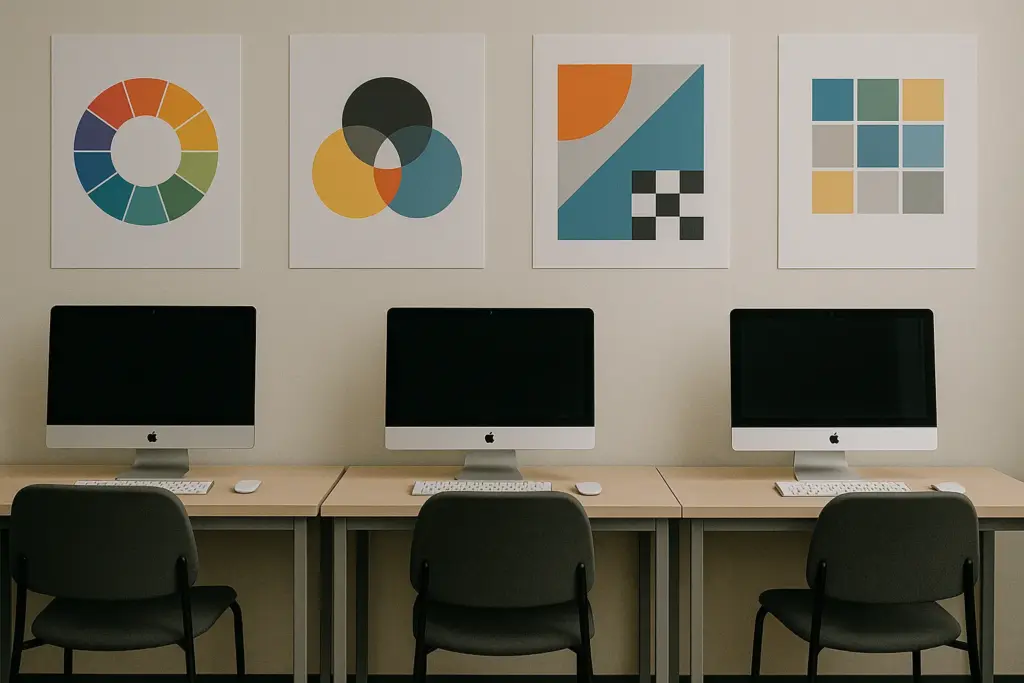
7. Colour Theory: Communicate Without Words
Colour is one of the most expressive tools in graphic design. It can spark emotion, guide the eye, and shape how people feel about your work, all without saying a word. When you understand colour theory, you can use each hue with purpose, not just for decoration.
At its core, colour theory involves the relationships between colours on the colour wheel. Complementary colours, for example, sit opposite each other and create a strong contrast. Analogous colours sit side by side and feel more harmonious. These combinations influence how viewers interpret mood and meaning in a design.
Beyond aesthetics, colour choices contribute directly to brand identity and visual communication. Think about how brands like McDonald’s or Spotify use consistent colours to become instantly recognisable. Choosing a colour palette that fits your message helps you effectively communicate your tone, values and purpose.
If you’re just getting started, tools like the Adobe Color Wheel can help you experiment with palettes and learn how colours interact. As you explore, consider accessibility as well. Good colour contrast improves readability for people with visual impairments and benefits everyone.

8. Rhythm and Movement: Design with Flow
Rhythm in design is much like rhythm in music. It creates a flow that leads the viewer’s eye from one part of your layout to the next. This visual rhythm brings energy, harmony and direction to your design.
There are several types of rhythm you can explore:
- Random rhythm: Elements repeat without a predictable pattern, often used for playful or abstract effects.
- Flowing rhythm: Elements are spaced in a way that mimics natural movement, like waves or curves.
- Progressive rhythm: Each repeated element changes slightly, such as increasing in size or colour to show progression.
Each style affects how your design feels. A layer cake pattern, for example, stacks repeated blocks of text and visuals in an organised rhythm. This is a great way to keep information digestible in posters or digital content.
Paired with rhythm is movement. This refers to the path the viewer follows across your design. It can be influenced by the placement of elements, directional lines or colour gradients. Movement guides attention to focal points and ensures your design has purpose and structure.
To learn more, check out this overview of types of rhythm in design by the Interaction Design Foundation. Once you start using rhythm intentionally, you will notice how much more dynamic and engaging your layouts become.
9. Unity: Bringing It All Together
Unity is the principle that ties your entire design together. When all the parts of a layout feel connected, the result is a more organised and professional presentation. Unity helps create harmony between text, images and shapes so your design feels complete rather than random.
A design with good unity uses consistent fonts, aligned layout structures and repeated visual cues. This ensures the viewer sees everything as part of the same message. Without unity, your work can feel disjointed or chaotic.
One way to achieve unity is to limit the number of fonts or colours in your design. Too many competing styles can confuse the viewer. Instead, repeat select graphic design elements and apply a consistent colour scheme to build cohesion. Try to balance one element against other elements in a way that supports your overall message.
Whether you are designing a classroom handout, a social media post or a group presentation slide, unity ensures your content looks purposeful. To explore this further, Smashing Magazine offers practical advice on creating cohesive web layouts using classical proportions and visual balance.
10. Real-World Application: From Theory to Portfolio
Knowing these principles is one thing. Applying them effectively is what sets a designer apart. In real-world projects, designers must combine creativity with problem-solving to develop layouts that not only look good but also work well.
Start small by applying what you have learned to a single design project. Use a grid system to structure your layout, apply a visual hierarchy to guide attention and repeat certain design elements for consistency. As you improve, challenge yourself to design across different mediums, such as flyers, infographics, digital ads or class presentations.
For students building a portfolio, showcasing your use of these principles is essential. A strong portfolio highlights your ability to create a sense of purpose and apply design thinking. If you are unsure how to start, check out Behance for inspiration from professionals and fellow students.
These principles are not rigid rules. They are tools to help you develop your creative voice and learn how to effectively communicate through design. Over time, you will begin to see these choices not as separate techniques but as part of a cohesive approach that shapes how people interact with your work.
Start Designing with Intention
Getting the hang of these 10 graphic design principles isn’t just about ticking boxes. They’re the foundation of designs that feel clear, intentional, and well-put together. Instead of relying on gut feeling alone, you’ll be able to create visuals that look polished and work.
If you are working on your next design project, try focusing on just one or two principles at a time. Revisit your layout and ask yourself if your visual hierarchy is clear, if your use of white space improves readability or if your colour choices reflect your message. These small steps build confidence and sharpen your creative judgement.
The more you practise, the more natural it becomes. Over time, these principles will not only improve your portfolio but also help you grow into a designer who creates with clarity, consistency and impact.
Ready to take the next step? Browse our student design resources on ClassroomEncounters.org and explore workshops, challenges and guides created to help you put these principles into action. Start applying what you’ve learned today and build the design skills that will shape your creative future.